
Clarity under chaos.
Bridgestone FleetFix, UMSI Capstone · B2B · AI Product Design
Description
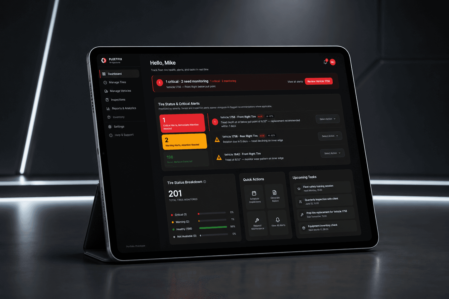
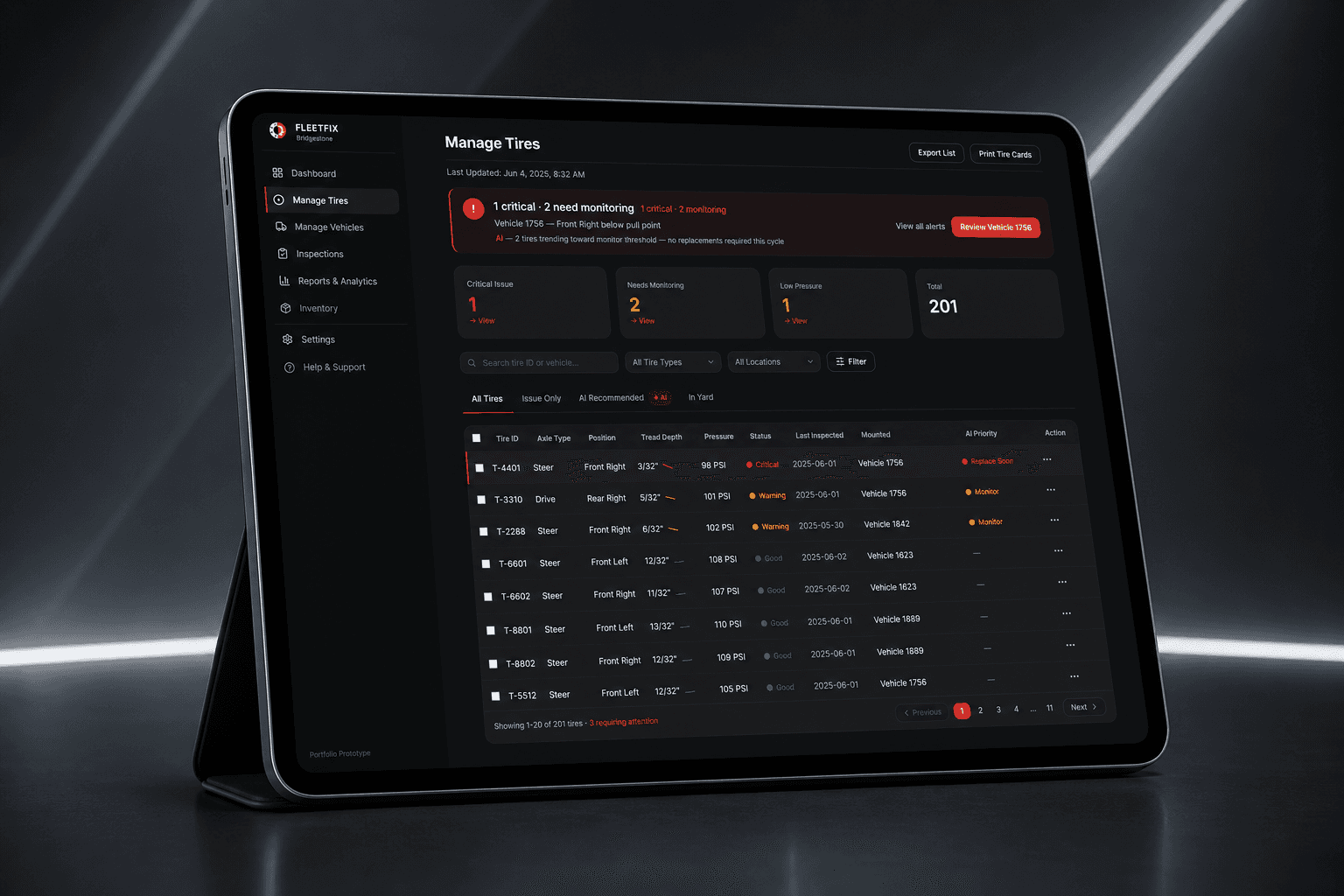
Fleet managers don't use dashboards in quiet offices. They use them in noisy garages, on Monday mornings, when something has already broken. We redesigned Bridgestone's platform around that, and around the harder problem underneath: how do you get a stressed human to trust an AI recommendation?
Context
Bridgestone is the world's largest tire and rubber company. A 5-person UMSI capstone team, 8 months. We inherited a fragmented toolset and found something harder inside it.
What I did
- Led product design for the capstone team, from research synthesis through interaction design and the clickable FleetFix prototype.
- Owned the trust pattern end to end: confidence scaffolding, contributing signals, and the override flow that became the project's through-line.
- Ran stakeholder interviews and usability testing, then translated findings into the five design moves behind every core surface.
- Presented the final direction to Bridgestone leadership. Project awarded First Prize, 2025 UMSI Student Project Expo.
Problem
The real problem wasn't fragmented data.
Bridgestone hired us to fix a messy multi-tool workflow. Tire pressure in one platform, tread depth in another, maintenance history in a third, Excel filling the gaps. That was real. But halfway through research we noticed something they hadn't framed for us: managers were ignoring the AI recommendations the system already gave them.
Not because the AI was wrong. By Bridgestone's own data, it was accurate most of the time. They ignored it because they couldn't tell why it had flagged something.
If I act on a recommendation and I'm wrong, that's on me. If I don't, that's on me too. I'd rather be wrong on my own judgment than on something I don't understand.
Mike, fleet manager, 175 vehicles
That reframed the whole project. The interface problem wasn't “show more data.” It was: how do we design an AI recommendation that a stressed fleet manager can verify in five seconds and act on with confidence? Everything we built downstream is an answer to that question.
Context
Why tire health is a high-stakes problem
Bridgestone is the world's largest tire and rubber company. Their B2B platform keeps tens of thousands of commercial vehicles on the road. A single blown tire on a delivery truck costs around $700 in towing alone, plus eight hours of downtime, plus every late delivery that cascades after it. Fleet managers are responsible for making sure that never happens, and they're the first to be blamed when it does.
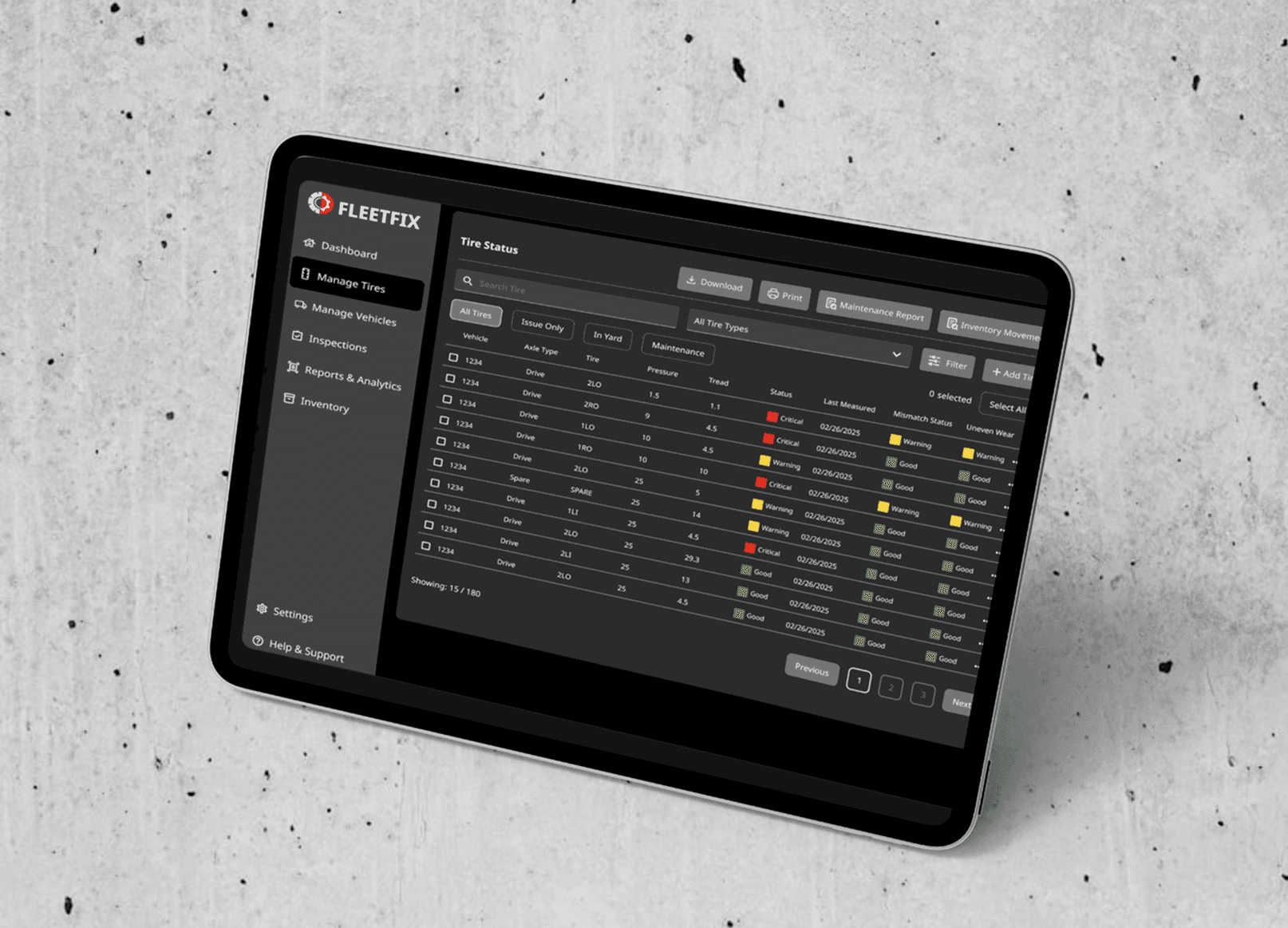
Before · existing Toolbox
Research
Who we were designing for
We designed across fleet scale, from a budget-strapped solo operator to a 4,000-vehicle analytics operation.
Miguel Rodriguez
Small fleet, tight budget, no support staff. He can only react to what's already broken. No bandwidth to get ahead of it.
No centralized system. Maintenance history and fuel costs live in scattered spreadsheets.
Affordable fixes and a clear way to justify maintenance spend.
“I am trying to work with what I got.”
Mike Samson
Arrives at 6am already behind. No real-time overview. Every morning starts as a guessing game.
Three tools that never agree, and AI recommendations he can't explain or verify before acting.
Quick morning triage with reasoning he can stand behind.
“I'd rather be wrong on my own judgment than on something I don't understand.”
Rebecca Strone
Works from home across Geotab, IntelliTire, and Toolbox. The first hour of every day is reconciliation before real analysis can start.
Rebuilds the same reports from scratch every week in Tableau. No shared export format between platforms.
Custom report generation without leaving the platform.
Different jobs, one shared feeling: the tools make the work harder, not easier.
Approach
We mapped decisions, not data
We started by mapping the actual decision-making journey rather than the data flow, current state and future state. The journey maps did real work: they told us what to design first. The highest-pain moments (the morning triage, the urgent alert, the unexpected breakdown) became the screens we prioritized.
We also storyboarded Mike's and Rebecca's mornings as hand-drawn comics. That sounds small. It wasn't. Drawing specific scenes (the slow loading screen, the missed tread-depth warning, the radio call to a driver already on the road) meant we could no longer design vague solutions for them.
- Start from user decisions, not data structure
- Identify the few signals that matter most
- Build a clear hierarchy from overview to detail
- Reduce noise while keeping depth one tap away
Emotion curve · future state
Iteration
From wireframe to morning triage
The dashboard went through three distinct passes. Each round answered a different question: not “does it look finished?” but “can Mike find the right truck in 90 seconds?” Usability testing between rounds is what turned a dark-mode reskin into a triage tool.
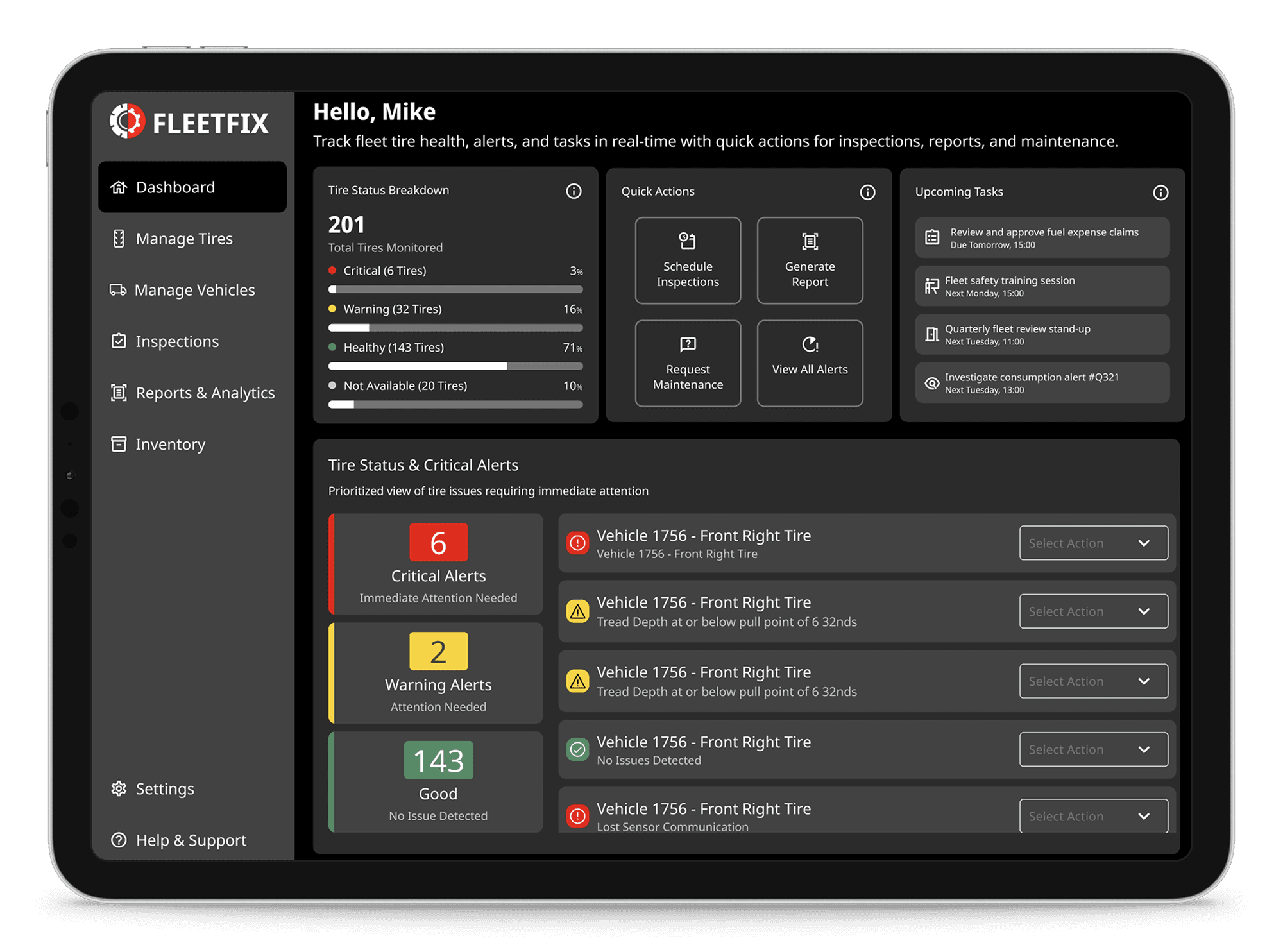
Lo-fi wireframe
- Mapped the current Toolbox. Every widget carried equal visual weight.
- Kept it grayscale to test structure before committing to color.
- Surfaced the core gap: no clear “start here” for morning triage.
Mid-fi concept
- Introduced dark surfaces and the stoplight color system.
- Added a Tire Status & Critical Alerts block with contextual dropdowns.
- Still too crowded. Six critical alerts and scattered widgets competed for attention.
Hi-fi prototype
- Critical alerts moved to a top banner so “where do I start?” was answered in one glance.
- Realistic fleet counts and quieter AI presence; only flagged items carry AI tags.
- Priority cards, alert list, and quick actions, with clear hierarchy and less clutter.
Key decisions
Five design moves
Once we had the trust problem clear, the rest of the project was a series of decisions answering one variation of the same question: how does the human stay in charge here? Five of those decisions did most of the work.
- AI recommendations always show their reasoning.Every recommendation surfaces three things: a confidence level shown as a 10-segment bar, the top contributing signals each with its weight in the overall assessment, and a one-tap override that records the user's reasoning back into the model. The goal isn't to make the user accept the AI. It's to let them verify or reject it in under five seconds. I considered making the confidence a single percentage number, but during testing the discrete segments made the AI feel like a colleague offering an opinion rather than a black box delivering a verdict. The segments became a feature, not a chart choice.
- The override doesn't end the conversation.When Mike disagrees with a recommendation and overrides it, the system doesn't hide the original advice. The recommendation stays visible in a muted state with a small line underneath: Overridden by Mike, Jun 4. AI will re-evaluate in 24 hours. This was the single most important interaction in the whole product. It said: we trust the AI enough to surface it prominently, and we trust the human enough to let them say no, and we treat the disagreement as data, not failure. In usability testing, this was the moment participants said they felt the system was a tool, not a judge.
- Critical alerts own the top of the screen.Mike's morning triage is about 90 seconds. In that window he needs to know what's critical, what can wait, and what just changed. The dashboard stacks three priority cards (critical, warning, good) with counts visible without scrolling. Each alert row carries a contextual action dropdown whose options change based on the alert type. Tread depth critical offers “Schedule Replacement” as the primary action. Pressure loss detected offers “Request Pressure Check.” The dropdown isn't a generic menu. It's the right next move, served up.
- One color system, used like a stoplight.Red for critical, yellow for caution, green for good. No blue “info” accents. No purple “AI” color. The product is dark-surface only because fleet garages have unpredictable lighting and dark interfaces handle glare better than white ones. In usability tests, the moment we removed every non-stoplight color from status indicators, scanning speed jumped.
- Saved views, not more filters.Users kept asking for “more filtering options.” Observation told a different story: they rebuilt the same three combinations every morning. Overdue. Due this week. By depot. So we added saved views instead of more filters. Mike named his first one “Monday list,” and the name stuck so well that we made it the default tab on the vehicle list page.
Prototype
The design in action
Five decisions did most of the work. Tap through them on the real dashboard.
Screens use representative placeholder data; some surfaces are simplified or omitted under Bridgestone's NDA.
Confidence scaffolding
The trust pattern in action. Set a threshold, see why each recommendation fired, and override what's wrong.
Confidence scaffolding
A simplified version of the surface I shipped. Set your confidence threshold; anything below gets flagged for your review. Click Why? on any row to see the signals. Override what's wrong; the correction trains the model.
Interface
The interface
Internally called FleetFix. Six core surfaces, plus mobile.
Three screen recordings from the clickable prototype. Switch flows to see morning triage, vehicle drill-in, and tire management in motion.
Trust pattern
The trust pattern, in detail
The AI recommendation card is the densest single piece of design in the product. It carries the most weight in the trust story, so it earned the most iteration.
A collapsed card shows the tire position, the recommended action, and the confidence bar. That's enough for triage. Expanded, the card reveals three contributing signals (tread depth, pressure trend, rotation age), each with its weight in the overall recommendation. Below that, a comparison line: 3 of 12 similar Class-8 tractors showed this pattern before failure within 14 days. This was the line that participants in testing pointed to first when asked what made them trust the recommendation. Specificity beat confidence.
Two buttons sit at the bottom of the expanded card. Schedule Replacement is primary, filled in brand red. Override Recommendation is secondary, outlined, always present.
The override flow asks for a one-line reason and a checkbox confirming physical inspection. After confirmation, the original recommendation doesn't disappear. It mutes. A line appears underneath: Overridden by Mike, Jun 4. AI will re-evaluate in 24h. The human has stayed in charge, and the system has acknowledged the correction without resentment.
This was the deepest design decision in the project. We could have made the override quieter, hidden behind a menu, the way most products treat disagreement with their algorithms. Making it co-equal with the primary action was a deliberate trust signal. Senior reviewers asked us about this in critique more than any other choice.
Results
What changed
We tested the final prototype against the existing Toolbox: three daily users, four tasks, before and after.
After · FleetFix prototype
This platform understands how Bridgestone systems are connected. I like how it makes it easy for me.
Samantha, industrial professional (usability test)
Outcome
Outcome
We presented to Bridgestone leadership at the end of the capstone and were awarded First Prize at the 2025 UMSI Student Project Expo, under the year's theme, Future of Work. Bridgestone took the research findings and prototype direction into their internal product roadmap.
Reflection
What I'd do differently
Talk to a tire-failure investigator earlier.
We spent the first six weeks with fleet managers, which made sense. But once we understood the AI-trust problem, we should have gone straight to the people who investigate failures after the fact. Their mental model (“what was knowable, and when?”) is exactly the model a confidence interface should support. We only stumbled into it by accident.
Ship the AI-confidence pattern as a standalone component.
Confidence, reasoning, and override was the most reusable thing we made, and we built it as a dashboard feature instead of a system. Designed as its own component with clear rules for any AI recommendation surface, it would have been far easier for Bridgestone to adopt across other products. If I were leading this project again, the confidence scaffolding would be the first thing I'd componentize, before any screen design started.
Resist the temptation to put AI everywhere.
Halfway through the build, every screen started growing AI labels. The dashboard had AI pills on alerts. The tire list had an AI banner. The inspection calendar had an AI suggestion. It looked diligent, but it was actually dilution. The trust story works because Vehicle Detail is the AI hero moment. Every other screen should reference AI more quietly. I pulled most of those labels out in the final pass, but I should have known earlier that AI presence and AI overload are not the same thing.
Takeaway
Takeaway
I used to think simplicity meant minimalism. By the end of this project I thought it meant clarity under chaos. The dashboard wasn't being used in quiet offices. It was used in noisy garages, on Monday mornings, when a phone was already ringing. Good design in that context isn't beauty, or even simplicity. It's making a tired person more right, more often, faster. The best tools quietly support the work without asking to be admired. That's the belief I bring to every product I touch, including AI ones, where trust is the whole game.