Client
Yifan Li
rOLE
Branding & UX Design
Date
Sept 2023
Skills
Branding Design,
Graphic Design, UX Design,
Typography, Color Theory
01
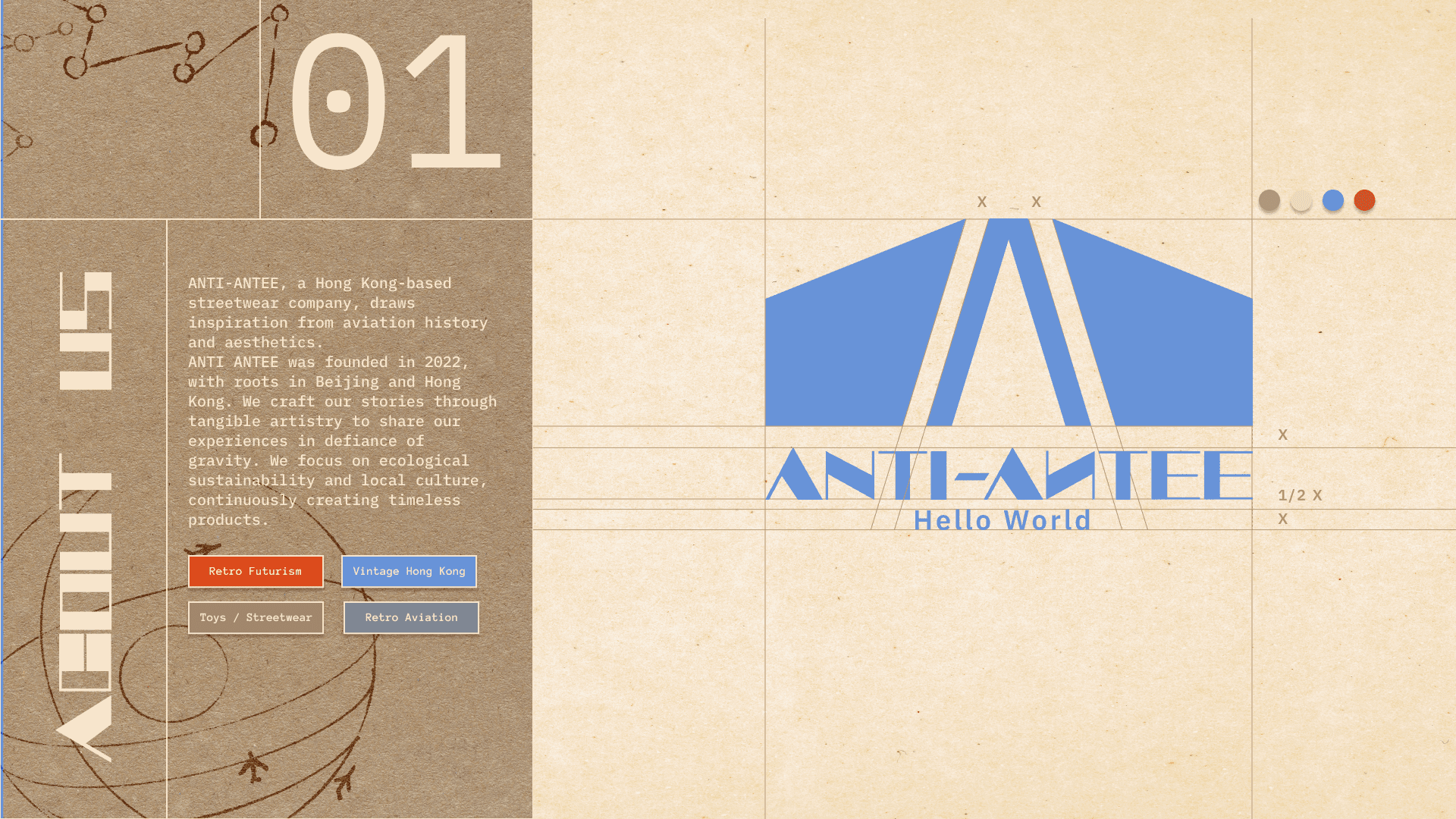
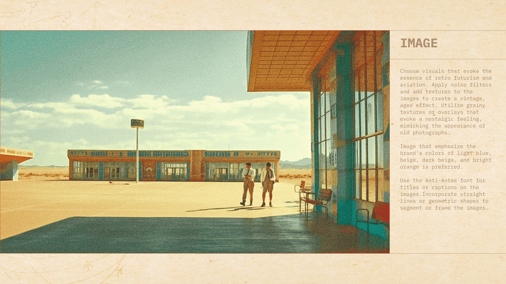
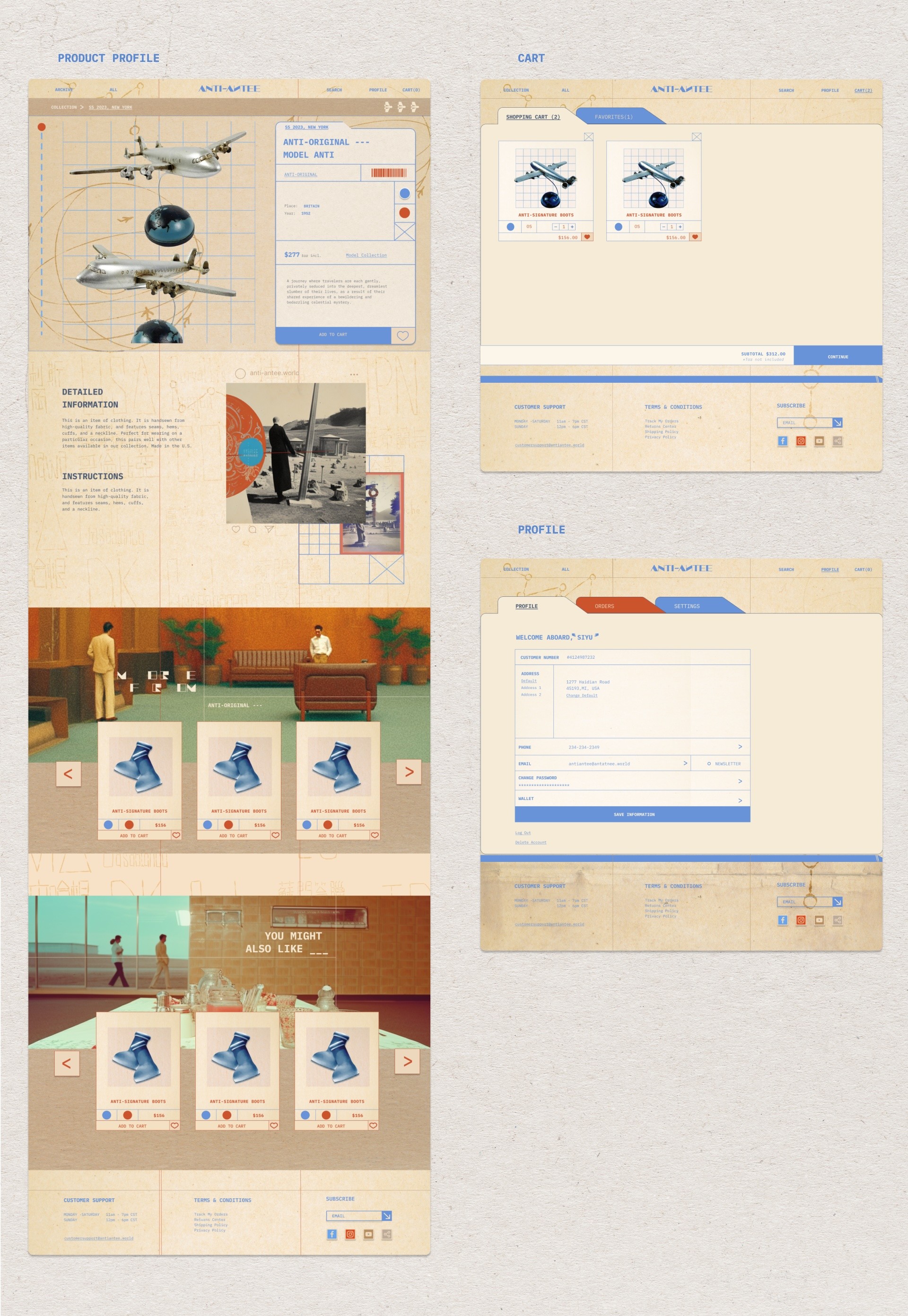
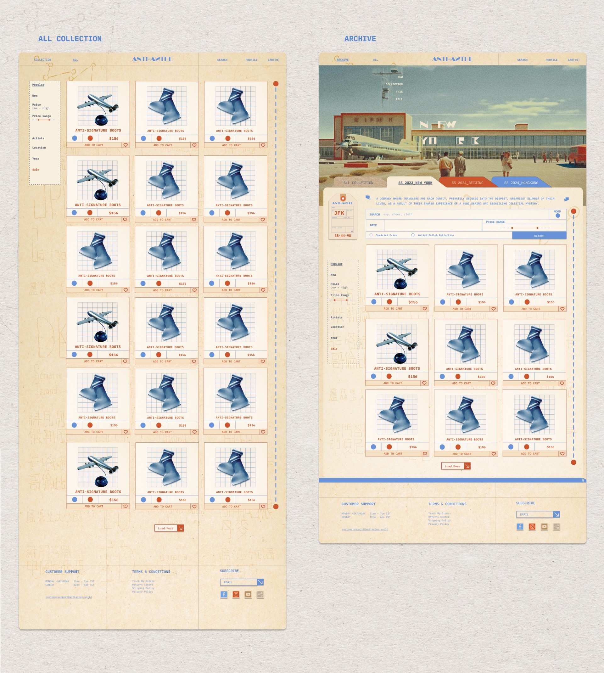
The challenge ANTI ANTEE faces lies in crafting a unique brand identity that seamlessly intertwines retro-futurism, vintage Hong Kong aesthetics, and aviation-inspired elements within the realm of streetwear.
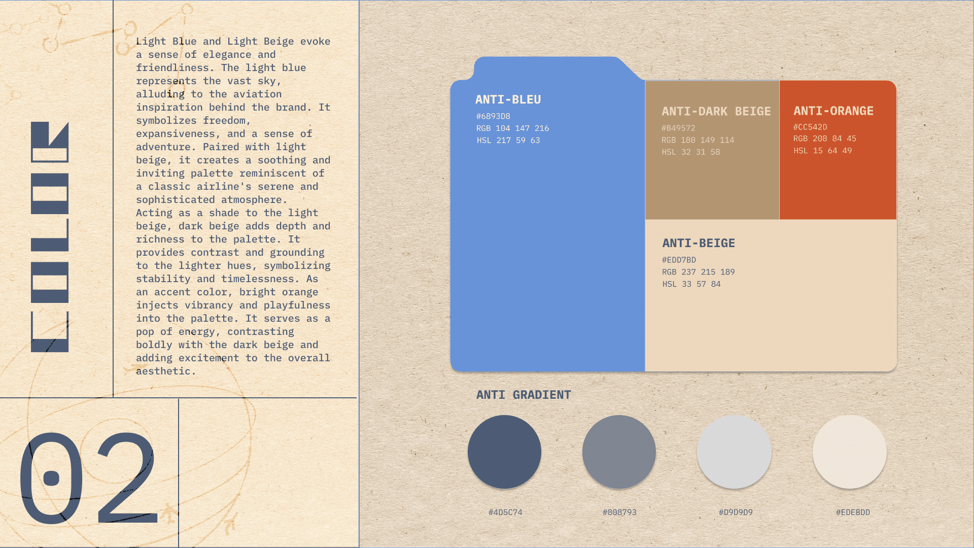
This demands the creation of a cohesive narrative that resonates with the brand's vision, leveraging a distinct color palette, typography, and imagery to encapsulate a timeless story that defies gravity while embracing ecological sustainability and local culture.
02
03
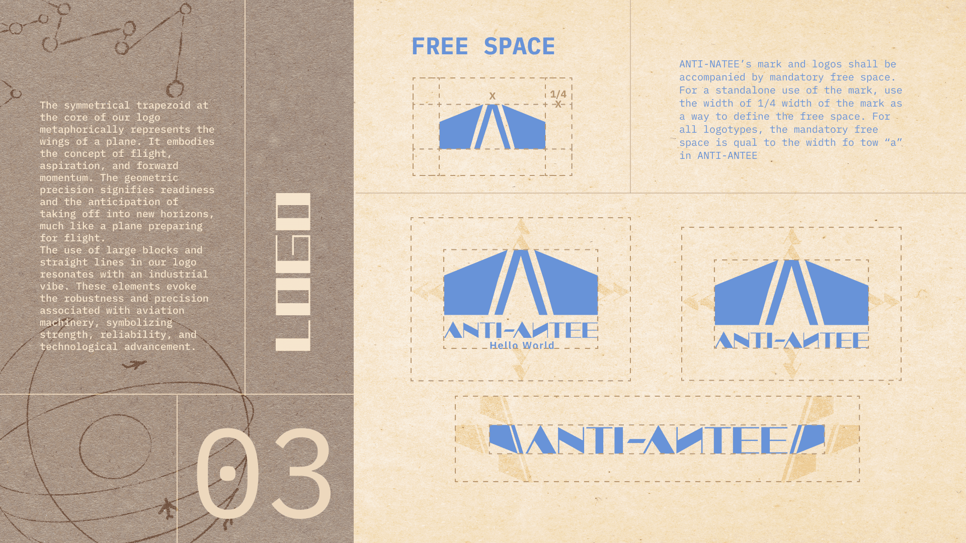
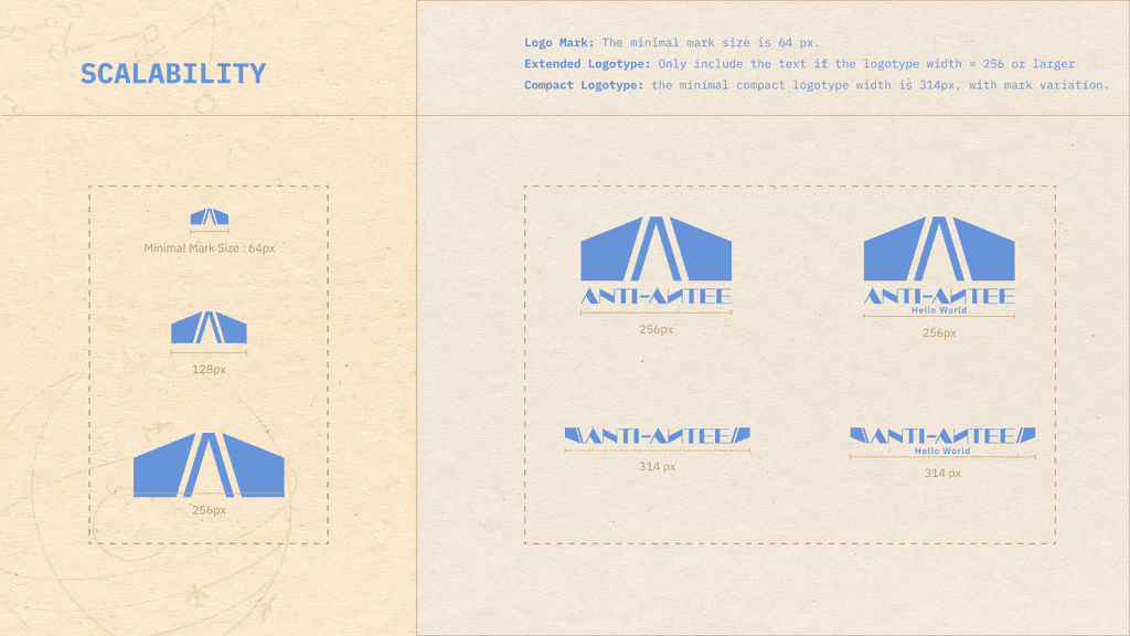
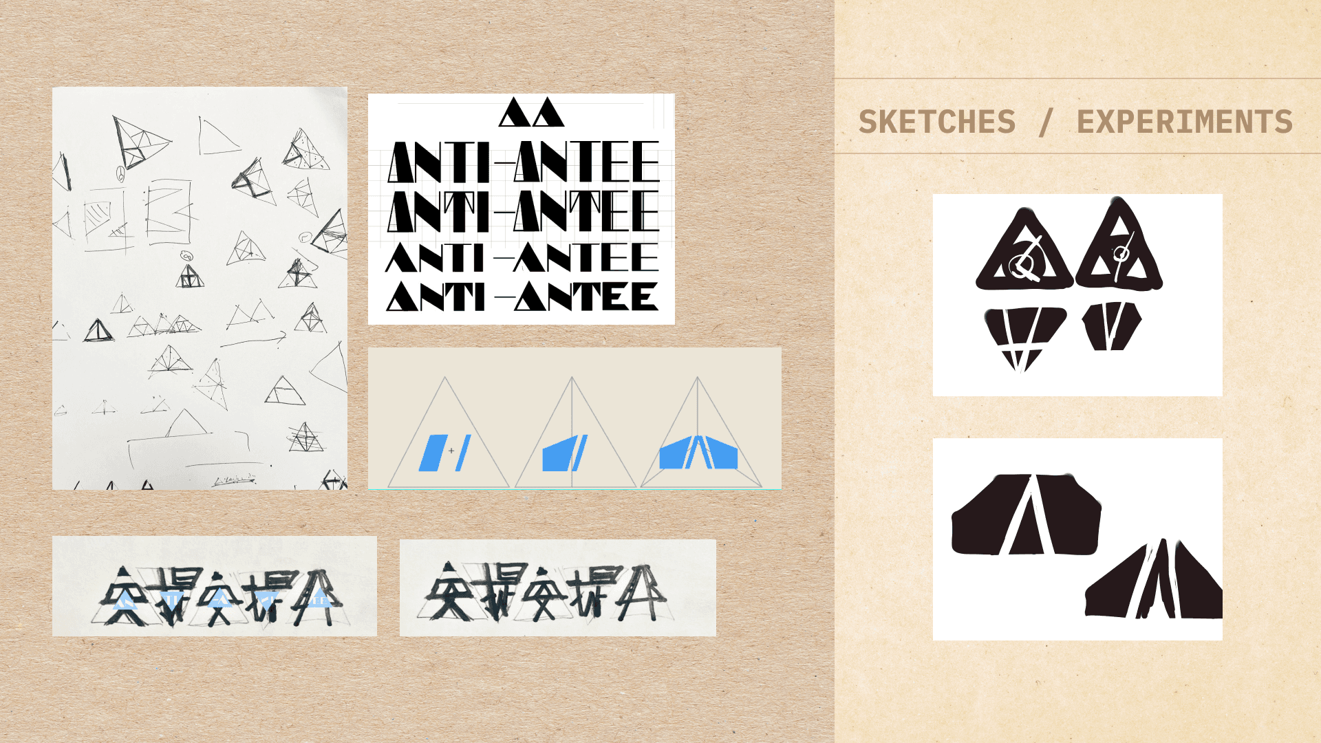
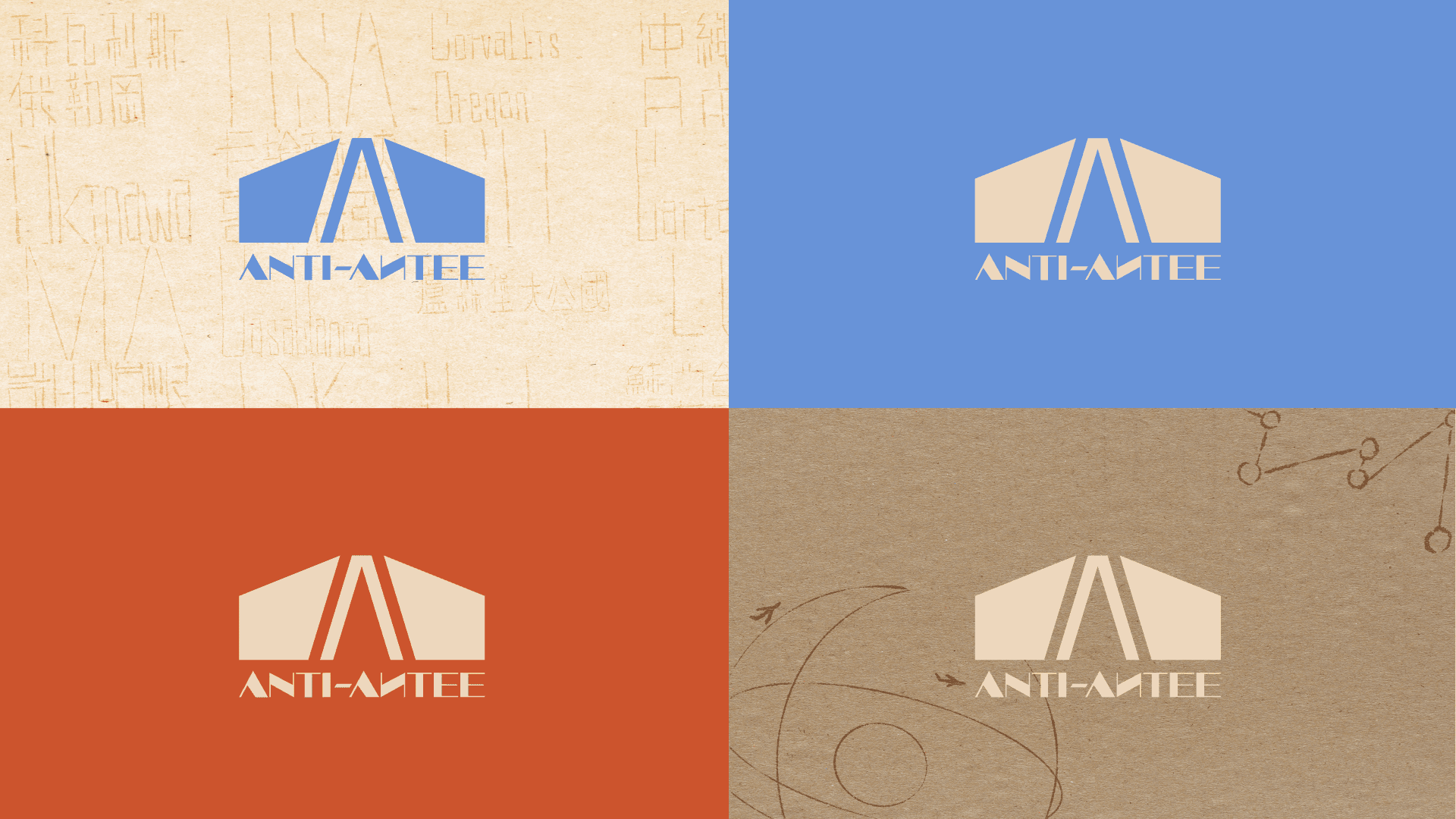
The symmetrical trapezoid at the core of our logo metaphorically represents the wings of a plane. It embodies the concept of flight, aspiration, and forward momentum. The geometric precision signifies readiness and the anticipation of taking off into new horizons, much like a plane preparing for flight.
The use of large blocks and straight lines in our logo resonates with an industrial vibe. These elements evoke the robustness and precision associated with aviation machinery, symbolizing strength, reliability, and technological advancement.
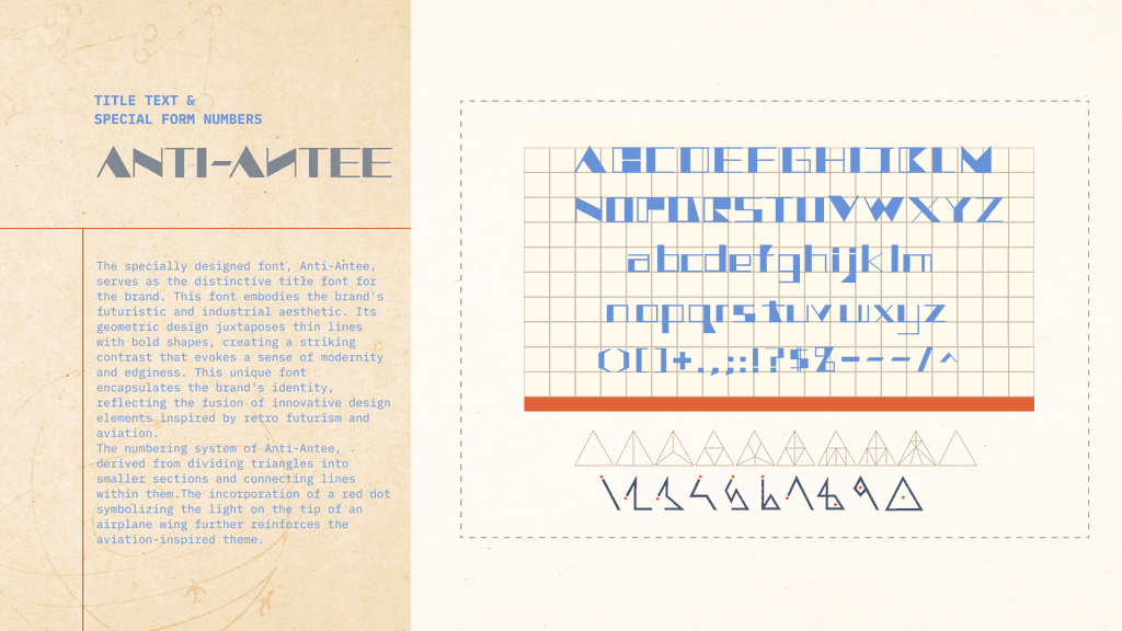
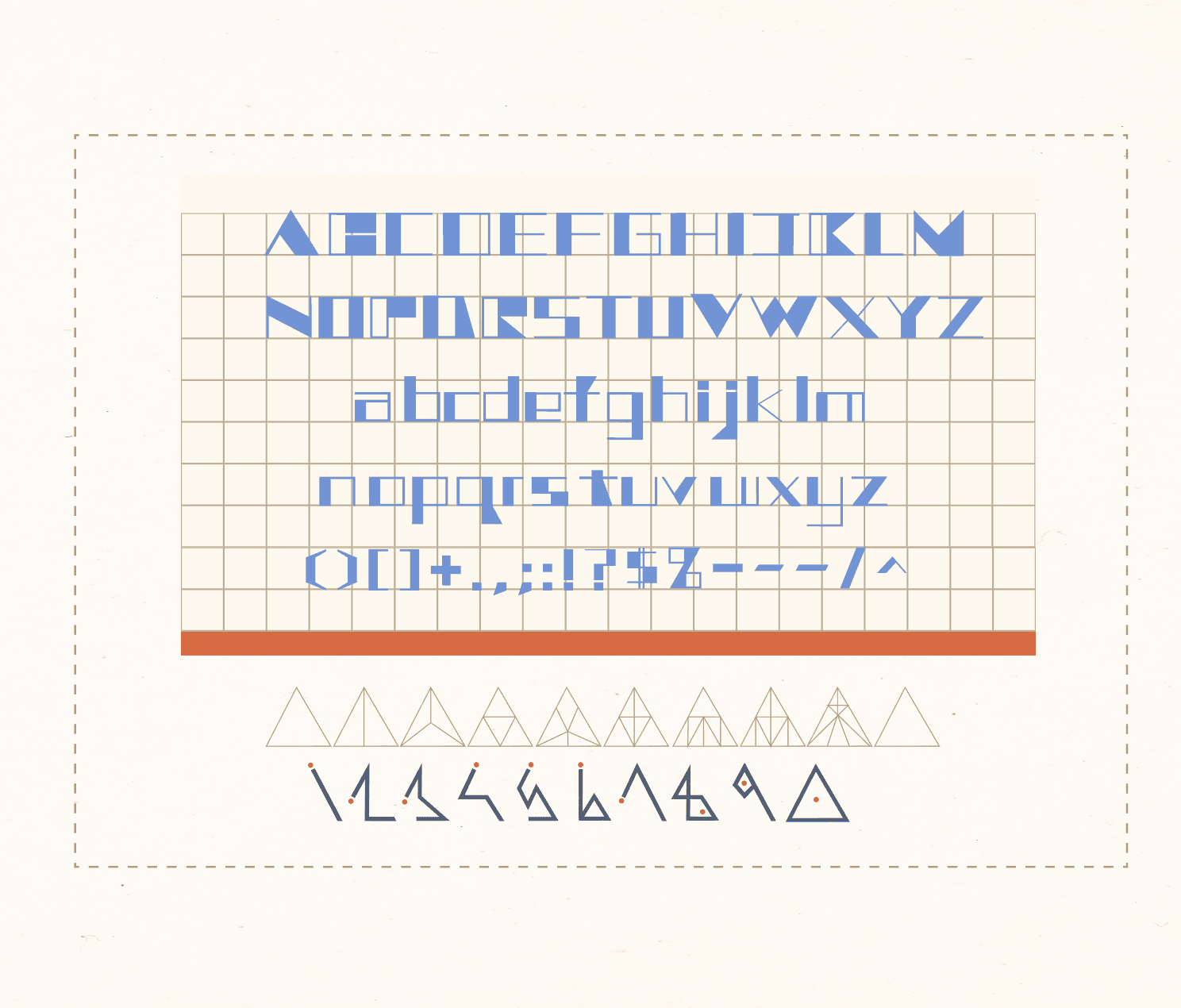
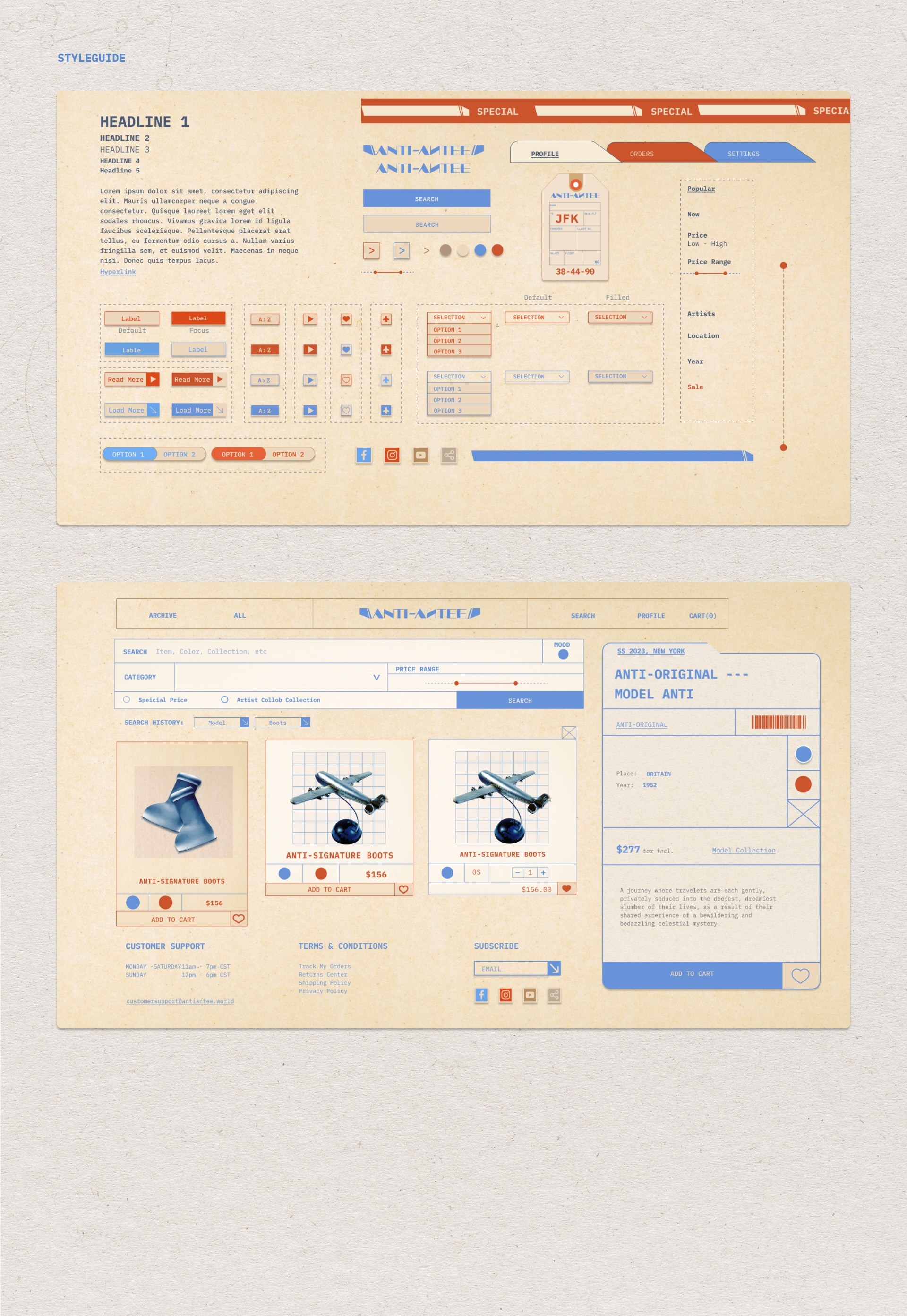
The specially designed font, Anti-Antee, serves as the distinctive title font for the brand. This font embodies the brand's futuristic and industrial aesthetic. Its geometric design juxtaposes thin lines with bold shapes, creating a striking contrast that evokes a sense of modernity and edginess. This unique font encapsulates the brand's identity, reflecting the fusion of innovative design elements inspired by retro futurism and aviation.
The numbering system of Anti-Antee, derived from dividing triangles into smaller sections and connecting lines within them.The incorporation of a red dot symbolizing the light on the tip of an airplane wing further reinforces the aviation-inspired theme.
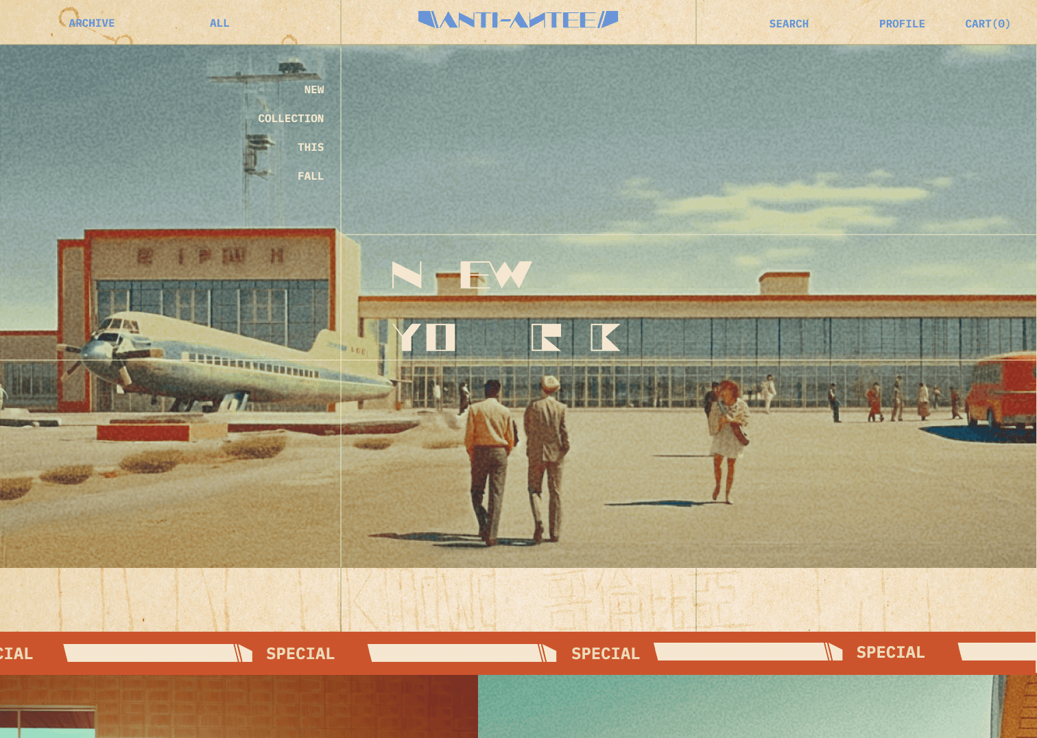
Website
The specially designed font, Anti-Antee, serves as the distinctive title font for the brand. This font embodies the brand's futuristic and industrial aesthetic. Its geometric design juxtaposes thin lines with bold shapes, creating a striking contrast that evokes a sense of modernity and edginess. This unique font encapsulates the brand's identity, reflecting the fusion of innovative design elements inspired by retro futurism and aviation.
The numbering system of Anti-Antee, derived from dividing triangles into smaller sections and connecting lines within them.The incorporation of a red dot symbolizing the light on the tip of an airplane wing further reinforces the aviation-inspired theme.
