NOAA GLANSIS Website Redesign
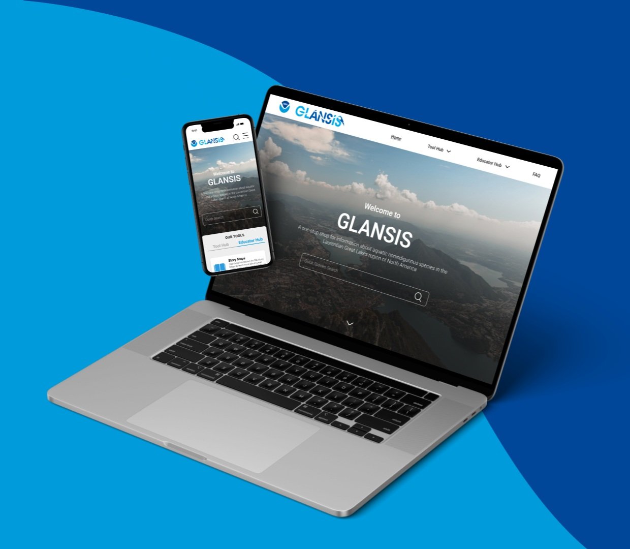
GLANSIS (the Great Lakes Aquatic Nonindigenous Species Information System) website is the Laurentian Great Lakes' "one-stop shop" for information on aquatic nonindigenous species (ANS). The site provides the available information to limit the introduction, spread, and impact of ANS in the Great Lakes by providing a comprehensive set of tools.
The goal of this project is to redesign the GLANSIS website to enhance its visual hierarchy for more efficient information access, focusing on the Homepage and Species List Generator.
Client
Rochelle Sturtevant
rOLE
UI & UX Design
Date
Feb - Mar 2024
Skills
UI/UX Design / Research
01
Problem Statement
User research shows that GLANSIS users encounter difficulties navigating the website, experiencing confusion, feeling lost, and encountering hurdles in finding or comprehending information. The website's lack of user-friendliness and unintuitive navigation make it difficult for users to access essential information, users can easily get lost in the busy information and lose patience.
Lacks optimized visual hierarchy, making it challenging for users to navigate and access information efficiently.
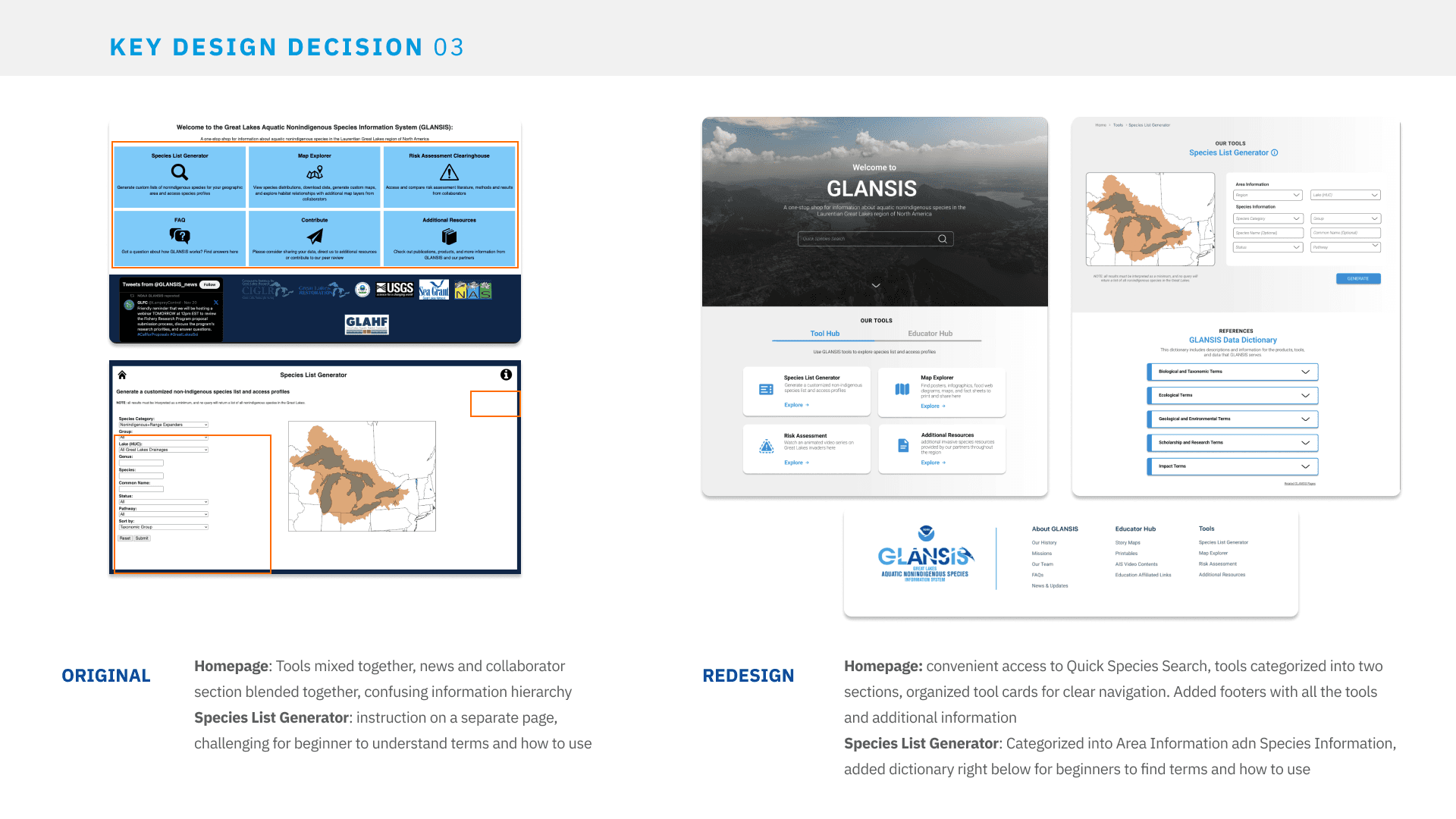
Unintuitive sections organization, leading to user confusion and hindered intuitive information access.
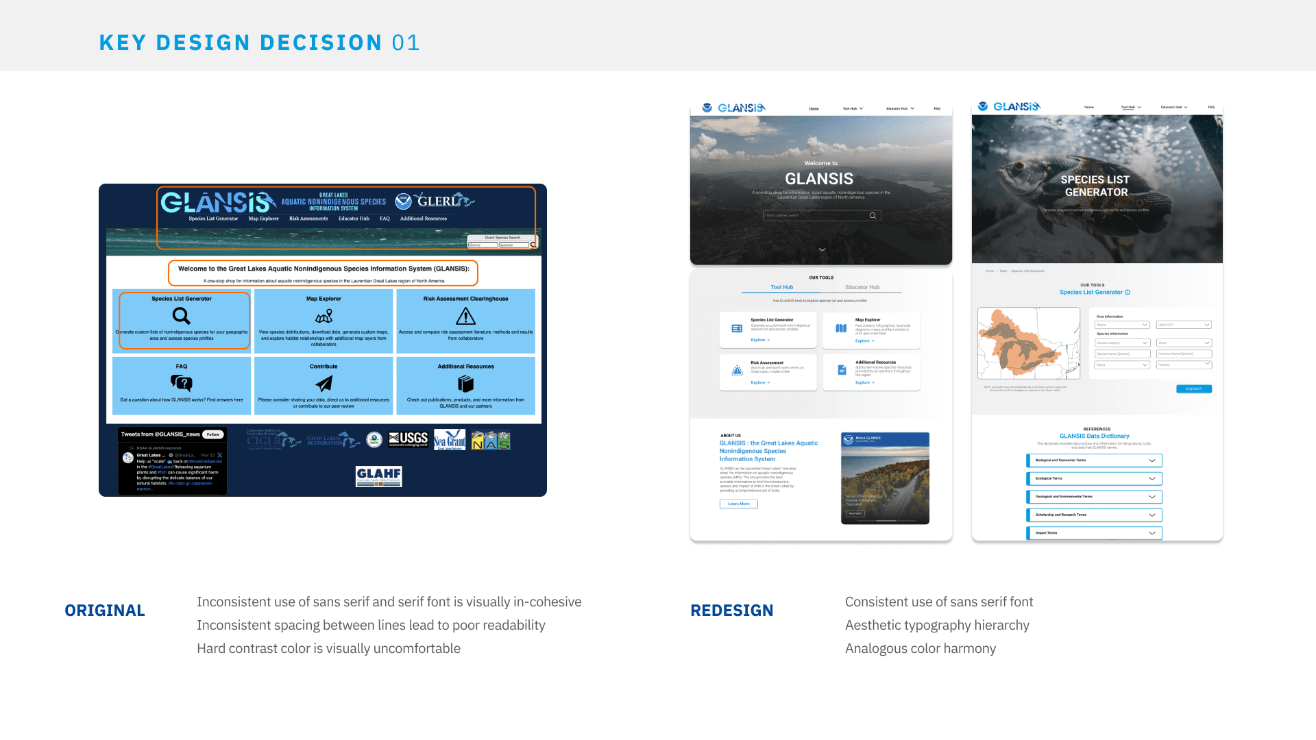
Outdated color scheme and typography layout, resulting in visually uncomfortable experience that overwhelms user.
02
Goal
The goal of this project is to redesign the GLANSIS website to enhance its visual hierarchy for more efficient information access, focusing on the Homepage and Species List Generator.
03
Design Walkthrough
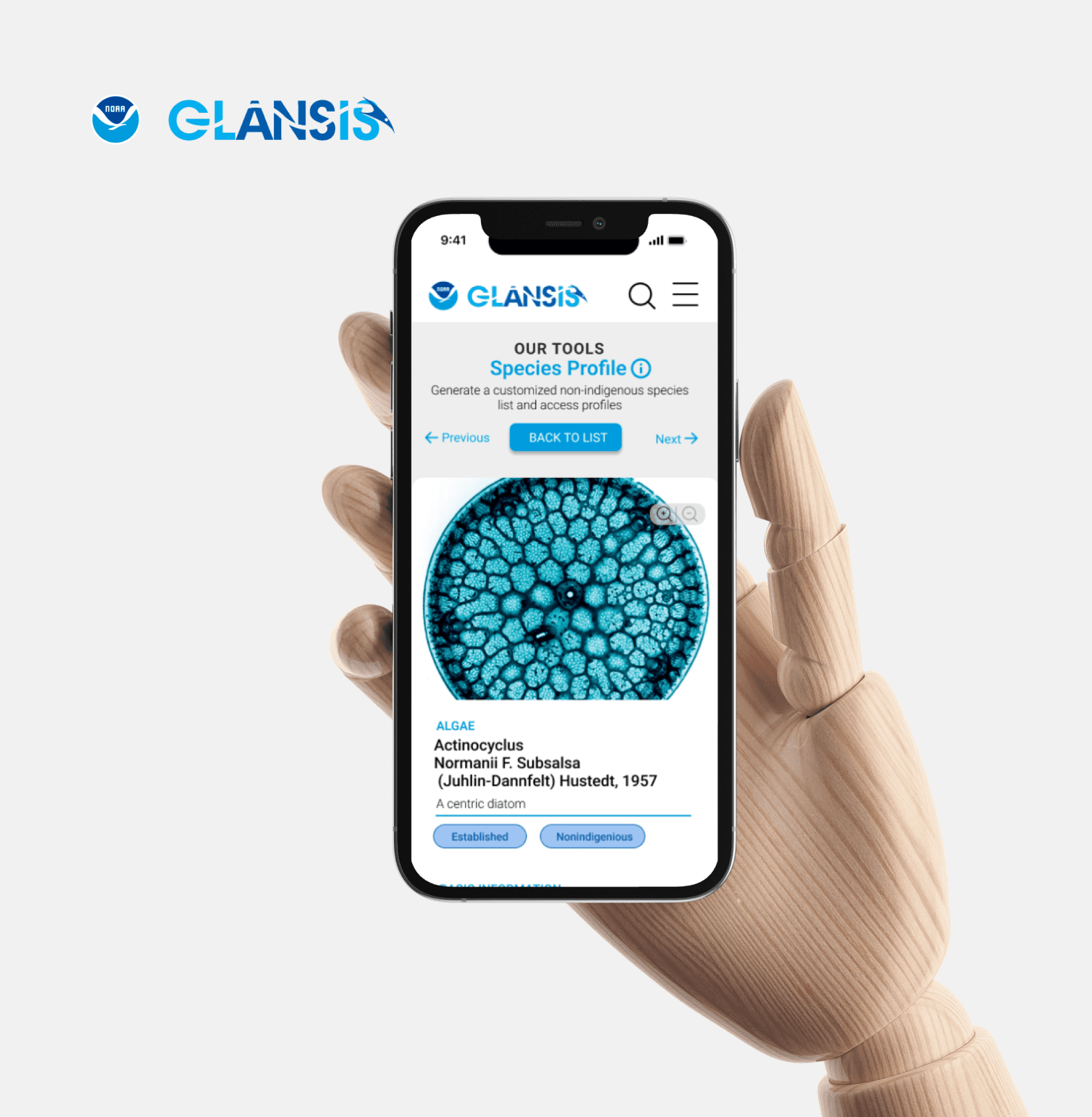
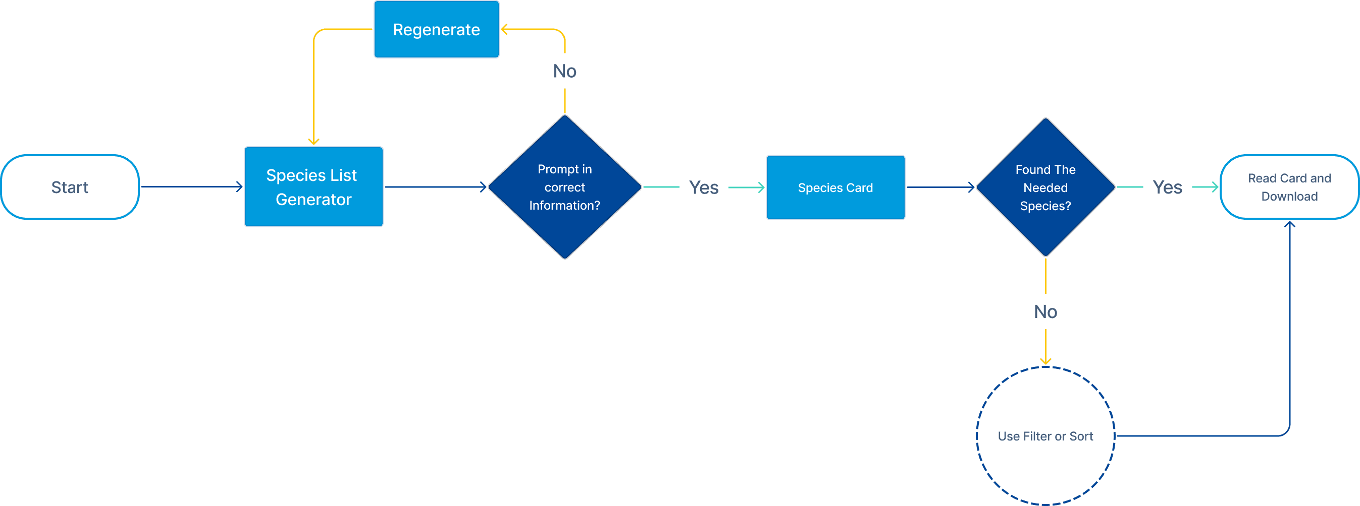
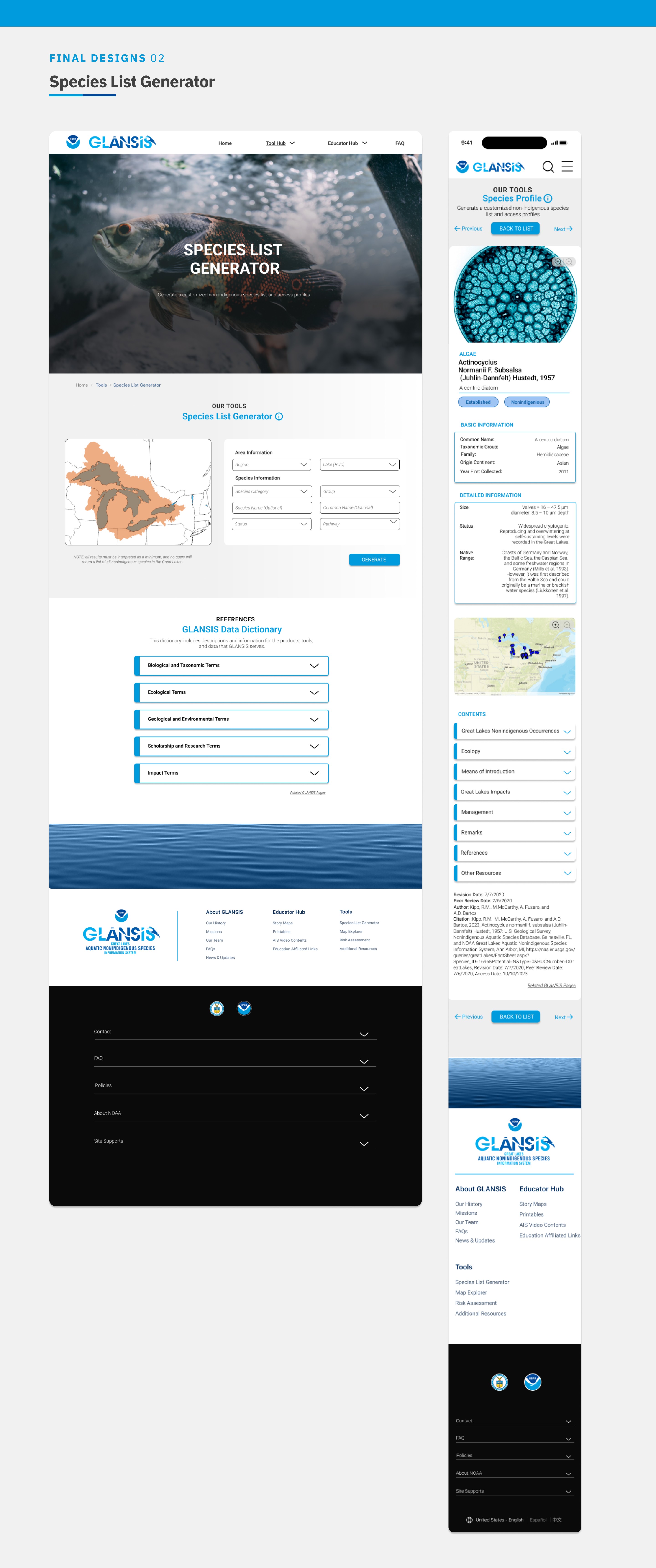
The Species List Generator empowers users to create customized lists of invasive species based on specific criteria such as geographic location and taxonomic classification, and access details through the Species Profile.
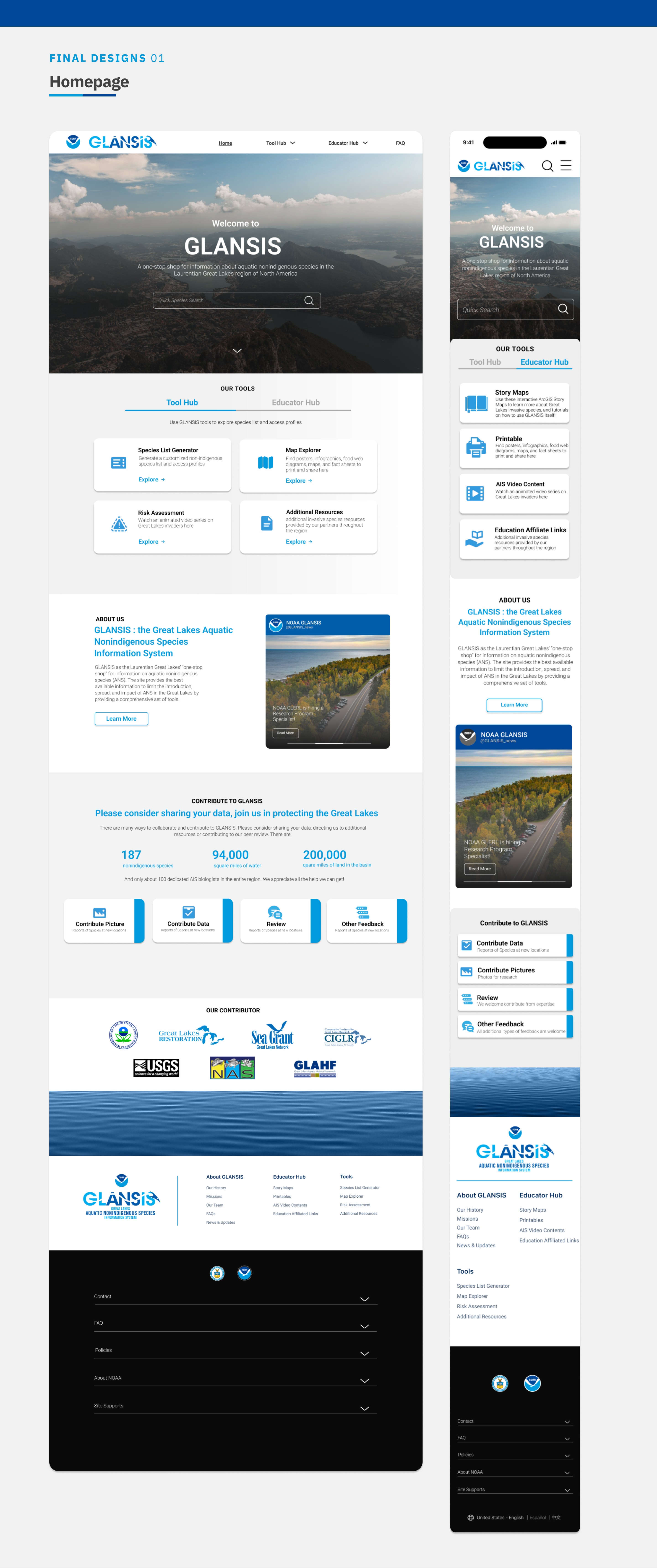
Upon accessing the tool, users will encounter a user-friendly homepage dashboard that offers clear navigation options.
They will be prompted to select criteria for their species list, providing intuitive dropdown menus, checkboxes, and search functionalities for efficient customization.
The redesigned interface will also include tooltips and dictionary help features to assist users throughout the process.
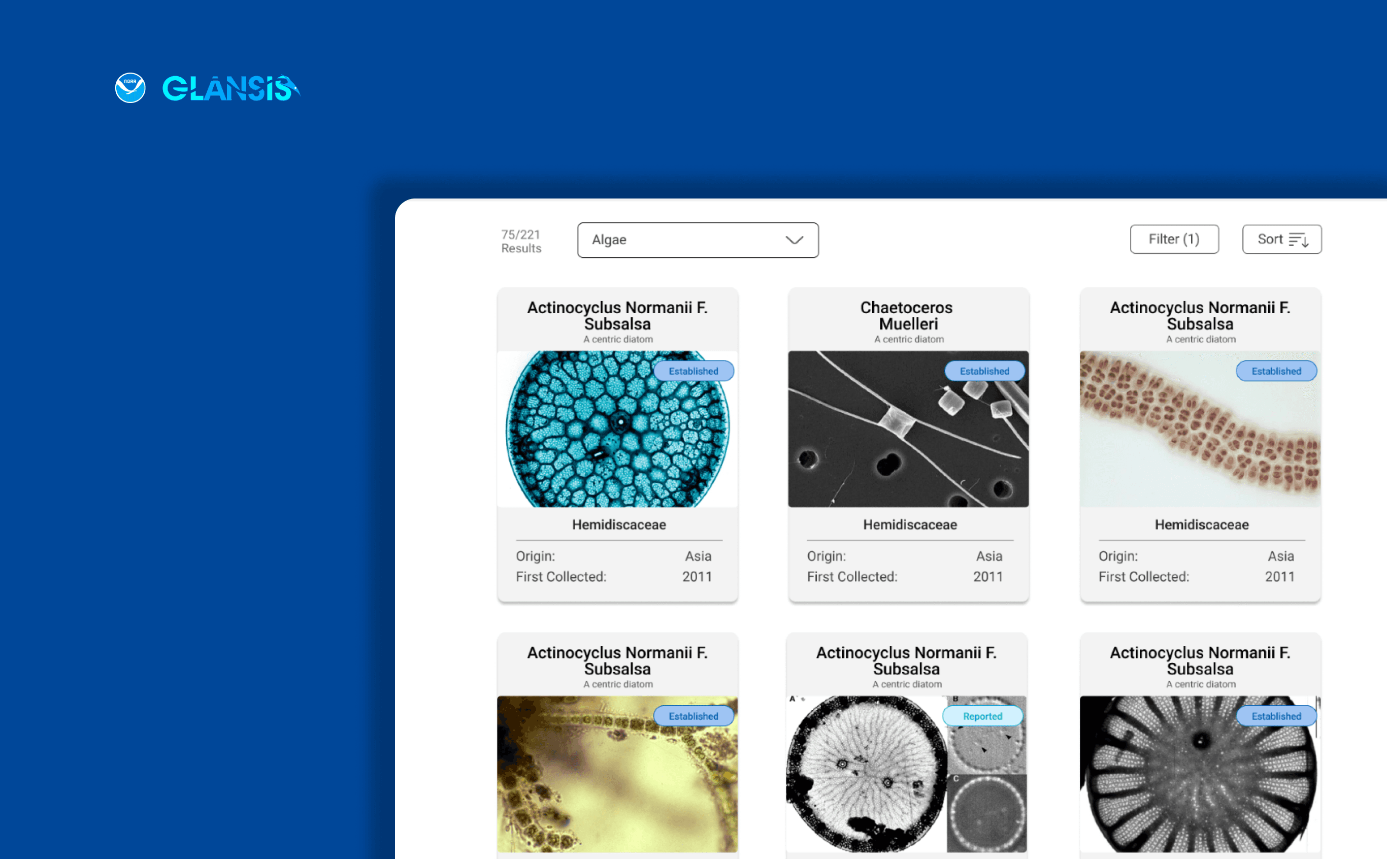
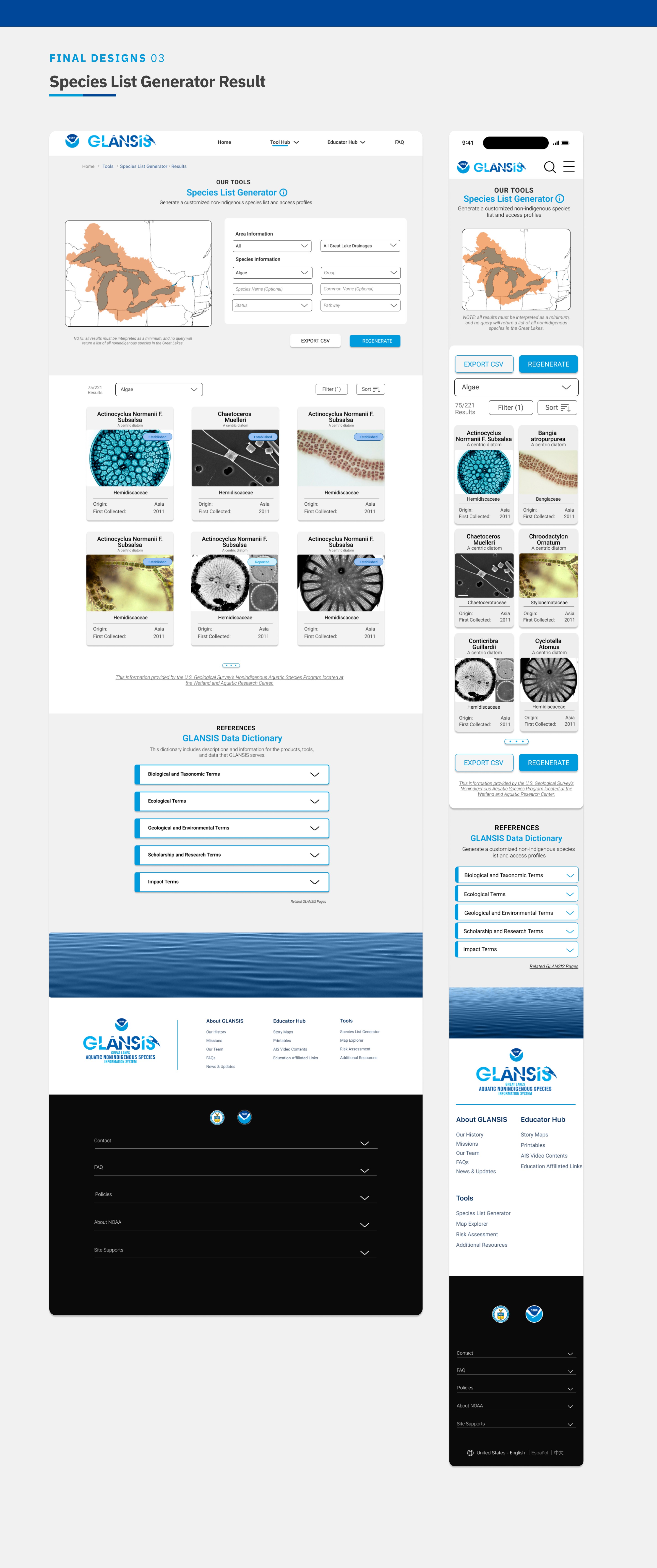
On the result page, enhanced filtering options and sorting capabilities will enable users to fine-tune their search results with ease.
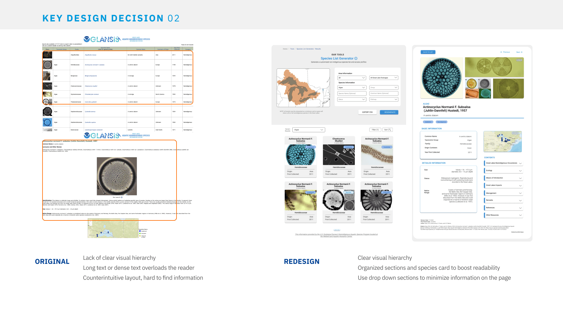
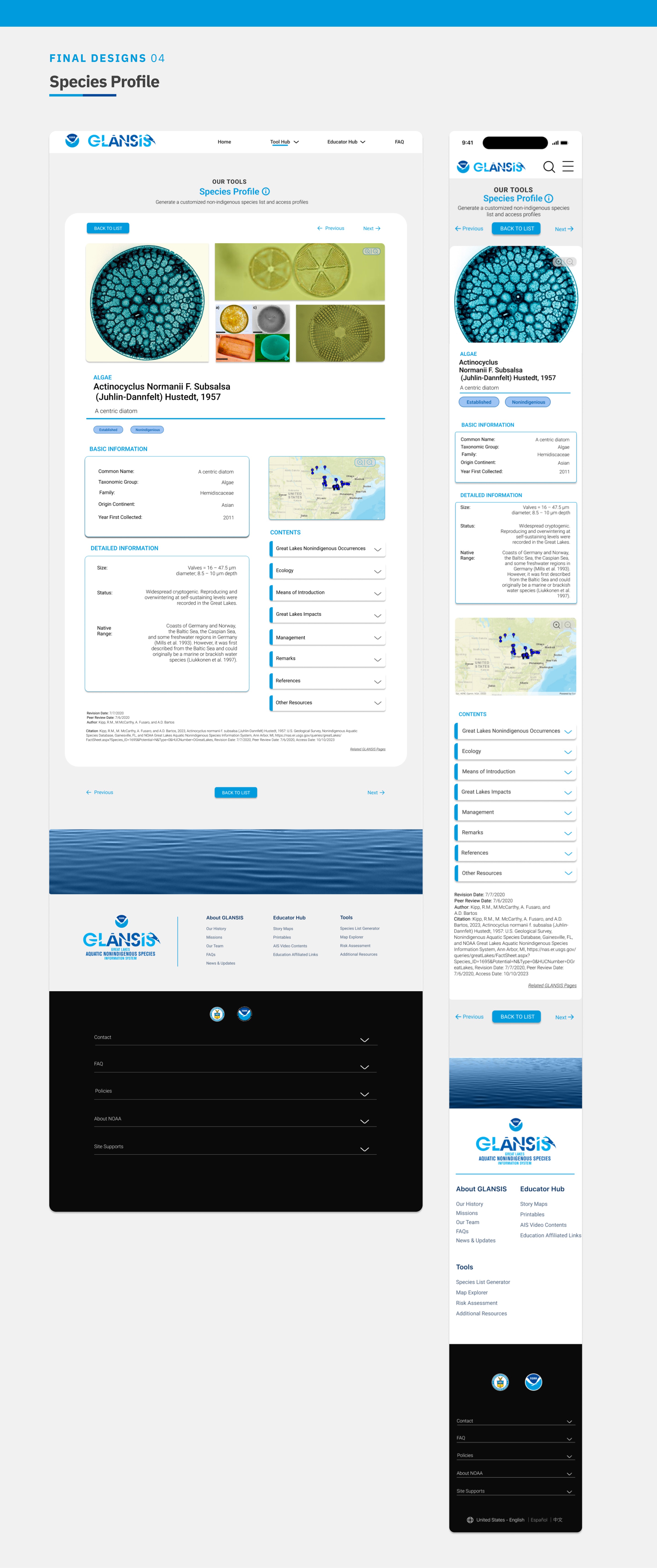
The redesigned Species Profile features clear visual hierarchy and organized information cards, allows user to quickly retrieve desired information.
04
Key Design Decisions
04.1
Consistent Styling
Update Typography and Color Scheme
Implementing modern typography and a visually appealing color palette is essential to bolster the branding identity of the GLANSIS website. By selecting contemporary fonts and harmonious color schemes, the redesign aims to create an aesthetically pleasing and cohesive visual language. Modern typography and thoughtful color usage contribute to a more engaging and memorable user experience, fostering a stronger connection between the audience and the GLANSIS platform.
04.2
Enhance Visual Hierarchy
Enhance Visual Hierarchy
Improving the visual hierarchy is crucial for guiding users effectively through the website's content. The redesigned interface will prioritize elements based on their importance, ensuring that key information, tools, and resources stand out prominently. Clear differentiation through size, color, contrast, and placement of elements will help users quickly identify and access crucial content. This enhanced visual hierarchy aims to streamline the user experience, reducing confusion and enabling smoother navigation, ultimately leading to increased user engagement and satisfaction.
04.3
Intuitive Layout
Reorganize Sections for Intuitive Information Access
The restructuring of sections within the website is aimed at creating a more intuitive and logical flow of information. By reorganizing content elements, such as tools, introduction, and footer section, the redesign seeks to optimize user access. Intuitive placement of sections and a coherent navigational structure will empower users to locate desired information efficiently. This reorganization aims to reduce user frustration, making it easier for visitors to find and comprehend relevant content, thereby enhancing overall usability and encouraging prolonged engagement with the GLANSIS platform.
05
