CLIENT
ROLE
DATE
SKILLS
Context
Bridgestone Corporation is the world's largest tire and rubber company, their fleet managers rely on various digital tools to track vehicle and tire health. However, their tire health management platform presented usability challenges, making it difficult for users to efficiently access key tools and insights.
What I Did
As the Lead UX Designer, I was responsible for conducting user research, building IA and wireframe, designing style guide, and prototyping. For data security, I have omitted confidential information in this project.
+60%
Workflow Efficiency
72
Workflow Effiency
-75%
Error Rate
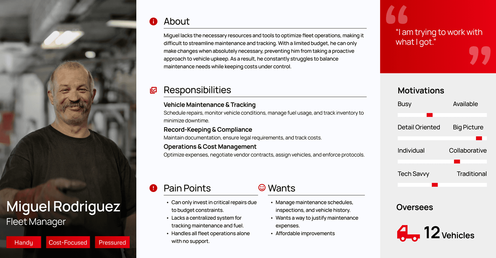
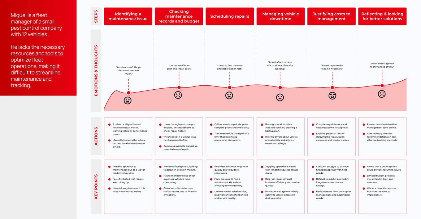
Tire maintenance today is fragmented and inefficient, leaving fleets vulnerable to delays and safety risks. Challenges include: decentralized data, lack of intuitive visualizations, and inconsistent alert mechanisms.
These inefficiencies hinder proactive maintenance, leading to increased downtime and operational costs.


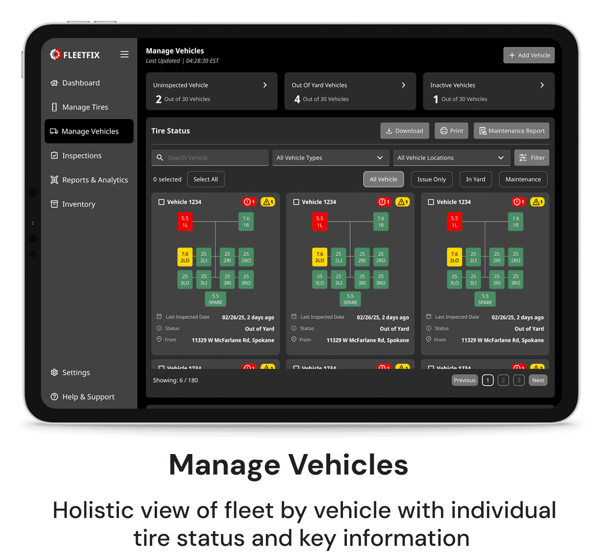
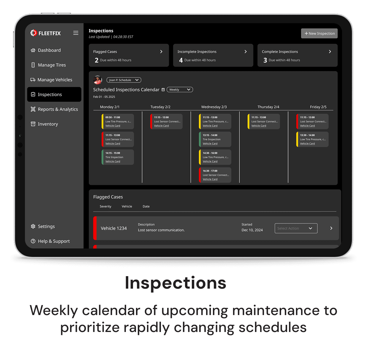
The redesigned app features a clean, clutter-free interface, making it easier for users to navigate and access essential features.
Heavily prioritized actionable data, direct attention where it is most needed
Tailored view for fleet managers, also adaptable based on profile authority such as for garage managers or fleet technicians
Filtering options were made a priority since users have varied interests when managing tires
The visual cues of red (critical), yellow (caution), and green (good) are implemented to easily distinguish tire status and health.

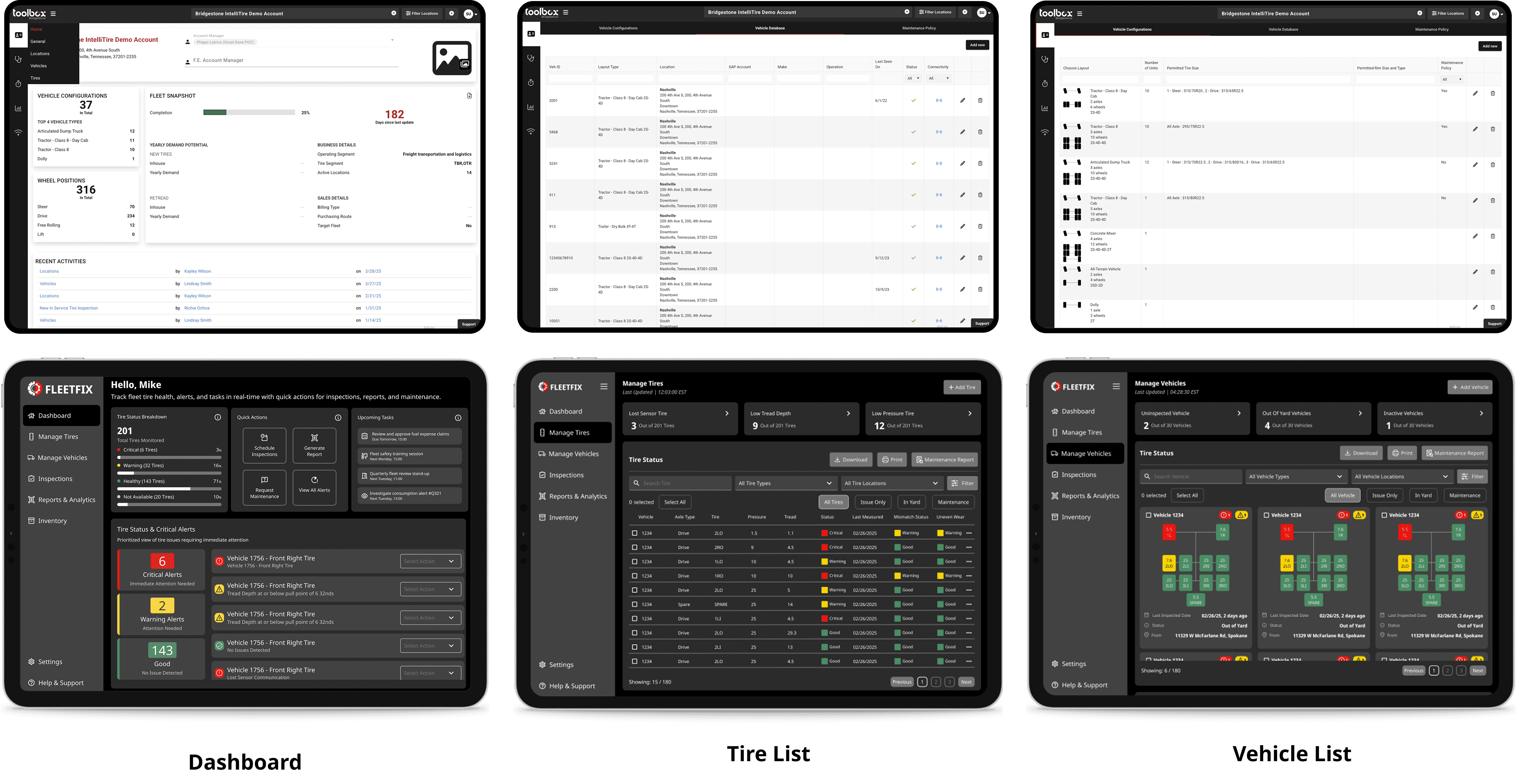
Manage Tire
Filters: Curate list views efficiently.
Quick Export: Easily share customizable datasets from list views.

Manage Vehicle
Vehicle Cards: overview of key information and can be selected to generate reports or view detailed data.
Vehicle Diagrams: visually display for better clarity.

Generate Report
Smart Filters: Narrow down datasets by vehicle type, location, or tire condition.
Custom Report Generation: Easily create tailored reports.
High-fidelity mockups and interactive prototype
UX research report based on interviews and usability testing
Design System
Presentation of findings to the executives


That experience changed how I see design. I used to think simplicity meant minimalism. Now, I think it means clarity under chaos. The dashboard wasn’t being used in quiet offices. It’s for real life, which is messy, noisy, and full of pressure.It reinforced my belief that the best tools quietly support creative work by removing unnecessary effort.
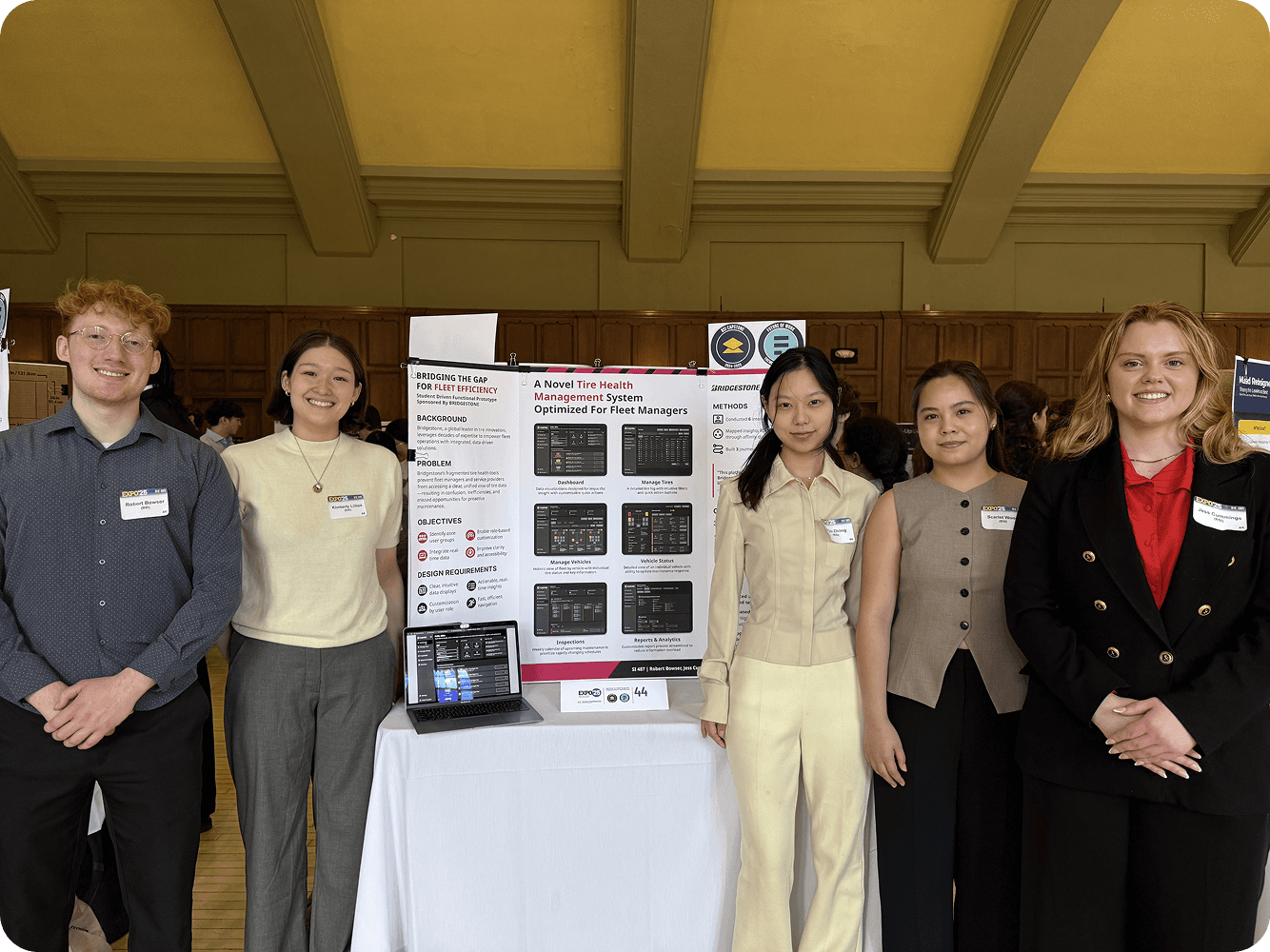

Our team won the first prize in UMSI Annual Expo Theme Year: Future of Work.