RoosRoast Coffee
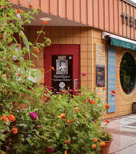
RoosRoast Coffee is a signature local coffee shop in Ann Arbor, MI with two locations and are available in many different grocery stores. At roosroast.com they have a gradual rise in e-commerce, but they want to make it even better.
The vision is to redesign the website to convey RoosRoast Coffee as a unique destination with strong community ties, while also addressing usability and functionality concerns to enhance the e-commerce experience.
Client
John Roos
rOLE
Branding & UX Design in a team of two
Date
Feb - Mar 2024
Skills
UX/UI Design / Research
E-Commerce Design / Research
Branding
01
Who is RoosRoast?
02
Problem Statement
Unintuitive layout on home page and product page, hard to acquire information within one page, leading to user confusion and difficult information access.
Limited representation of community engagement and brand personality. Lack of RoosRoast introduction, signature product and font on the homepage.
Poor visual hierarchy makes it hard to distinguish product details and information and compare between multiple products. Unable to edit product details before payment.
03
Interview &
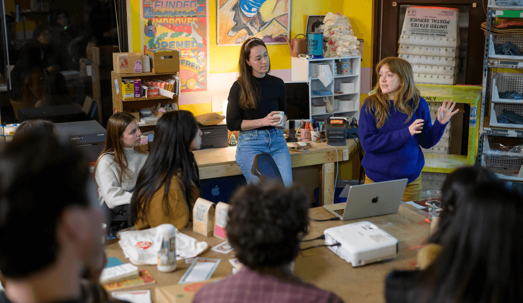
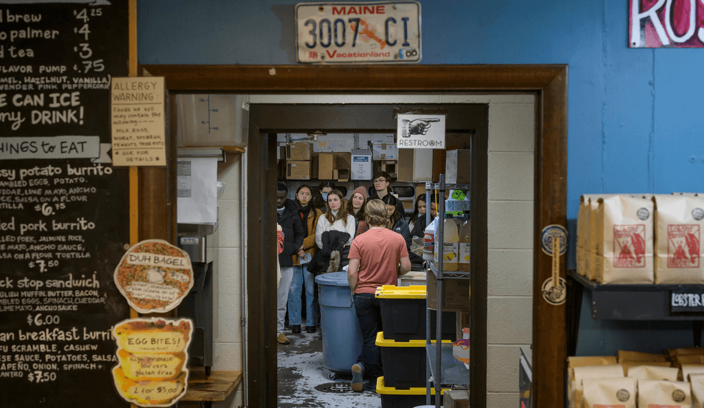
Field Visit
“The RoosRoast brand is deeply embedded in the Ann Arbor community,” says Hannah Stanton-Gockel, RoosRoast communications manager. “It’s part of people’s everyday lives, whether they come in here to have a cup of coffee every day and talk to the baristas, or whether they make coffee at home.”
04
Competitive Analysis
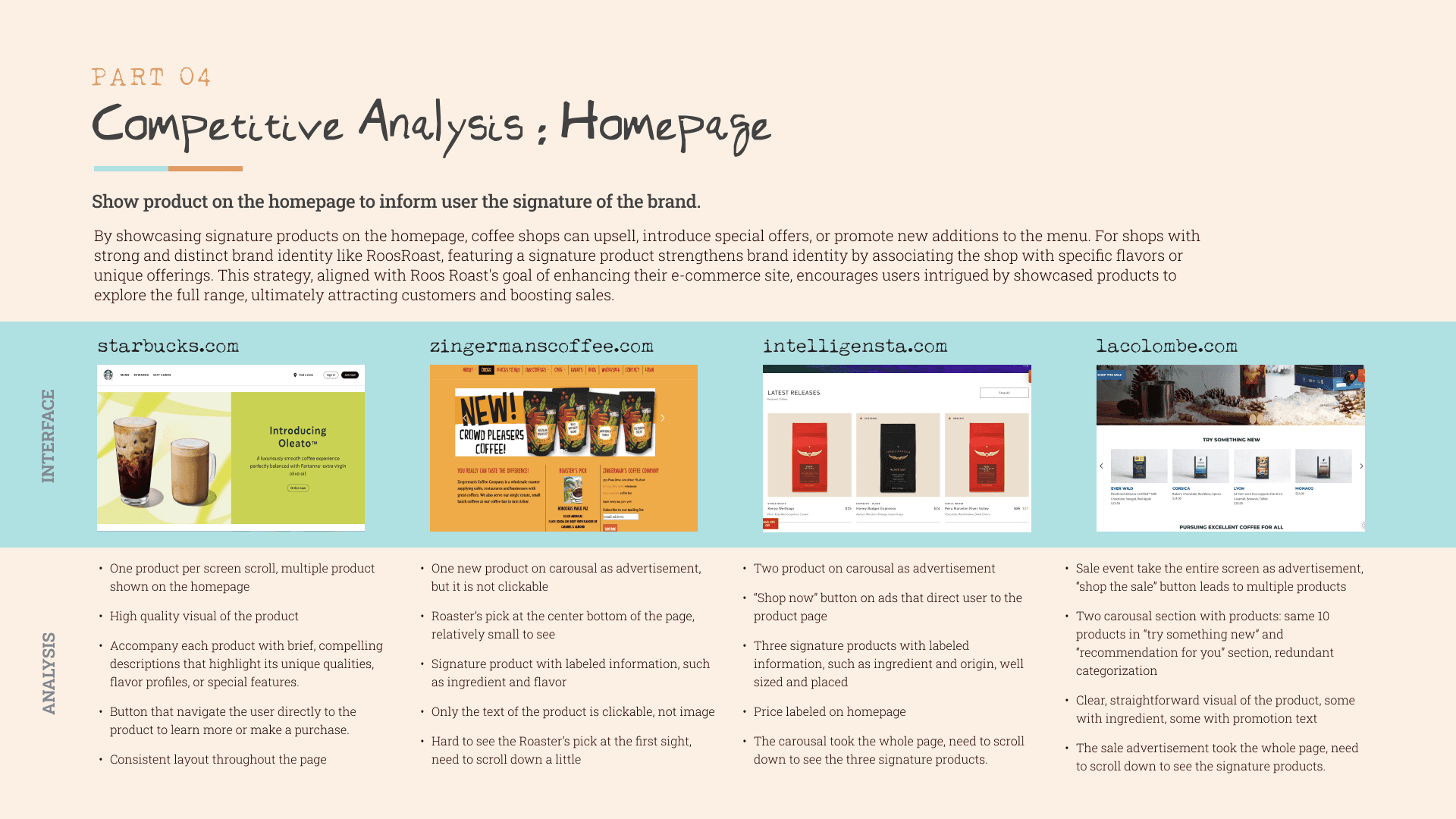
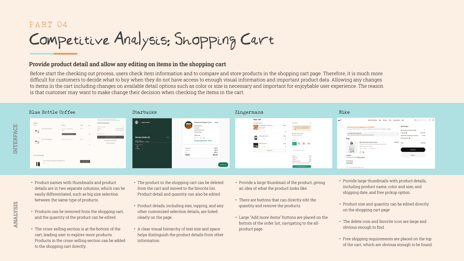
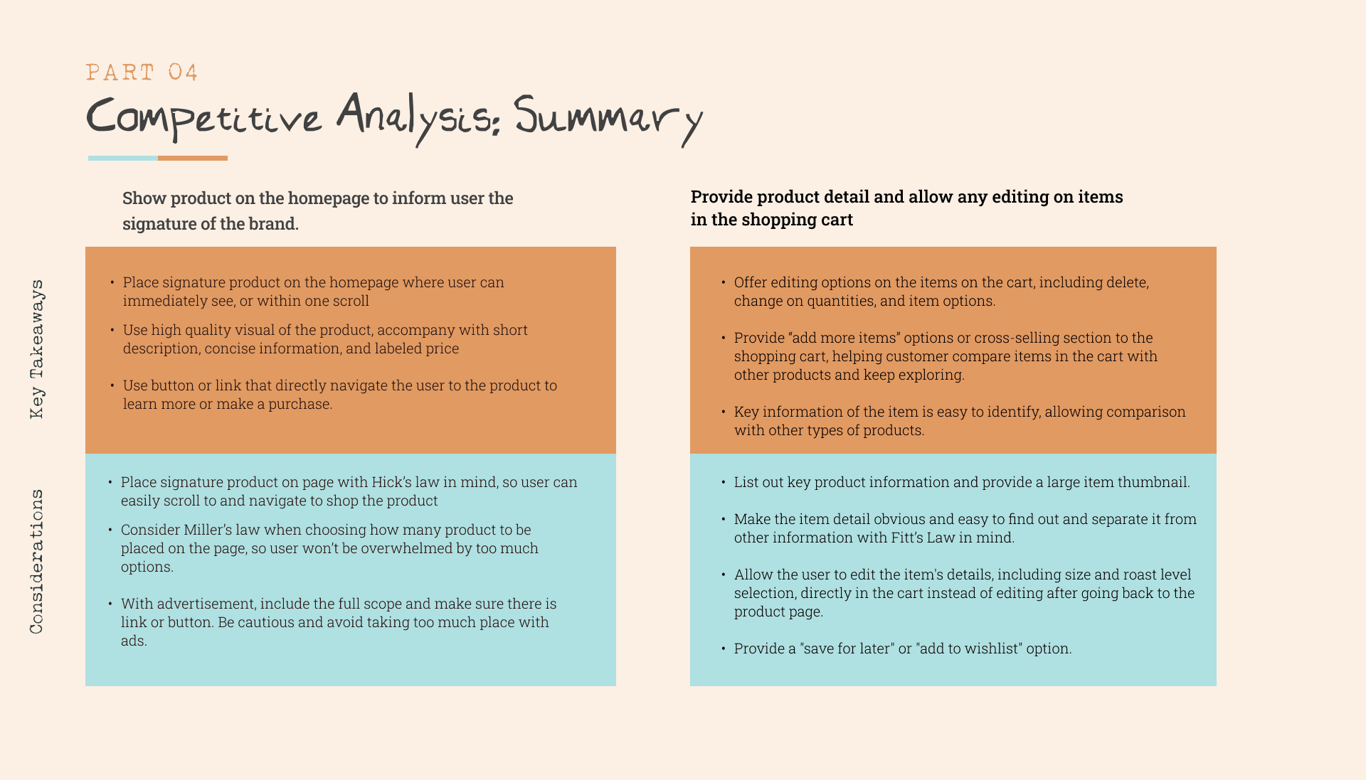
Our team started exploring potential solutions for this project by researching varying analogous and direct competitors to see what other coffee companies were doing well and how we could incorporate similar elements into our design.
We took a deeper dive into the HOME PAGE and SHOPPING CART of some of our competitors to analyze their strengths and weaknesses.
05
Proposed Solution
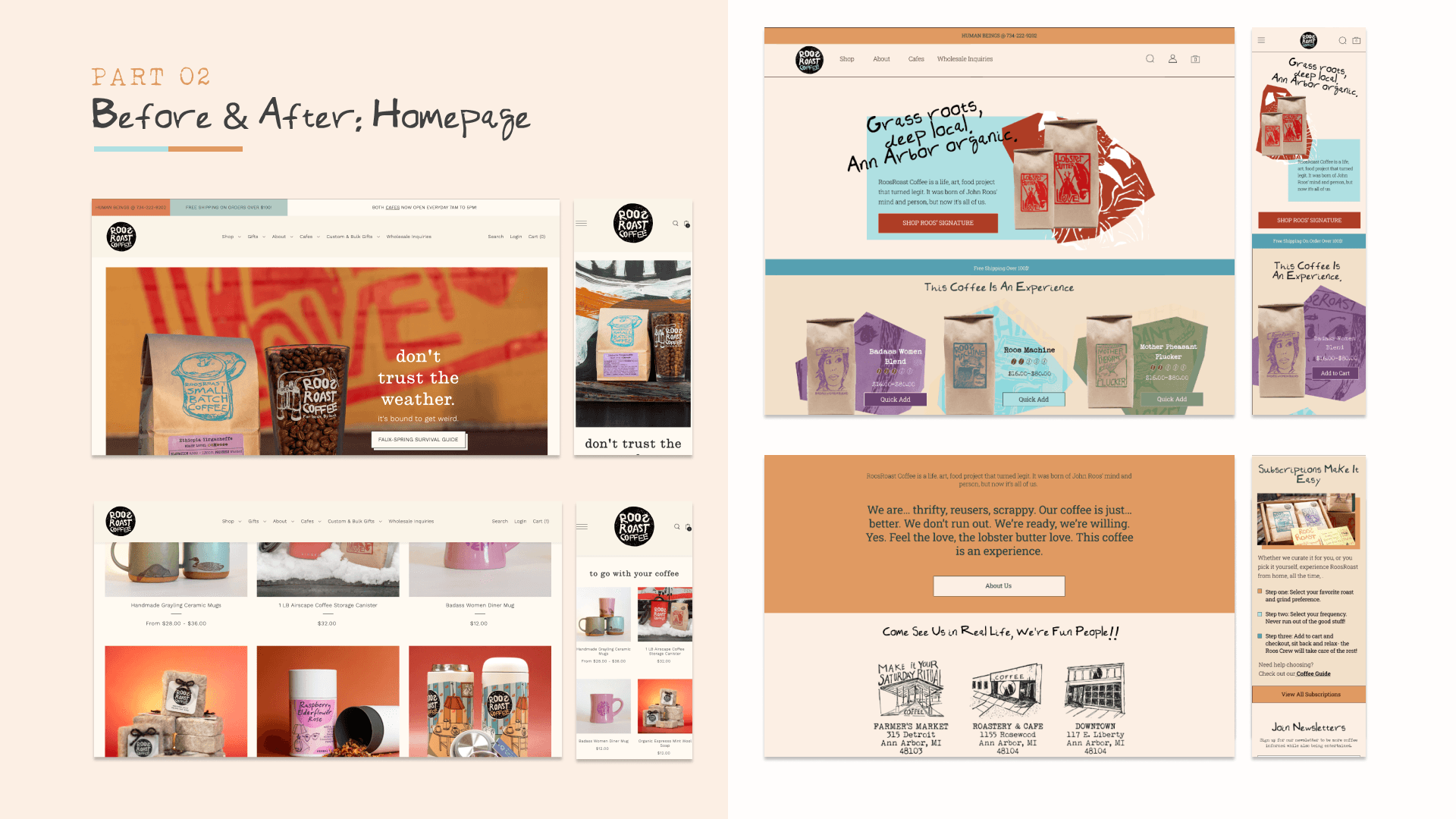
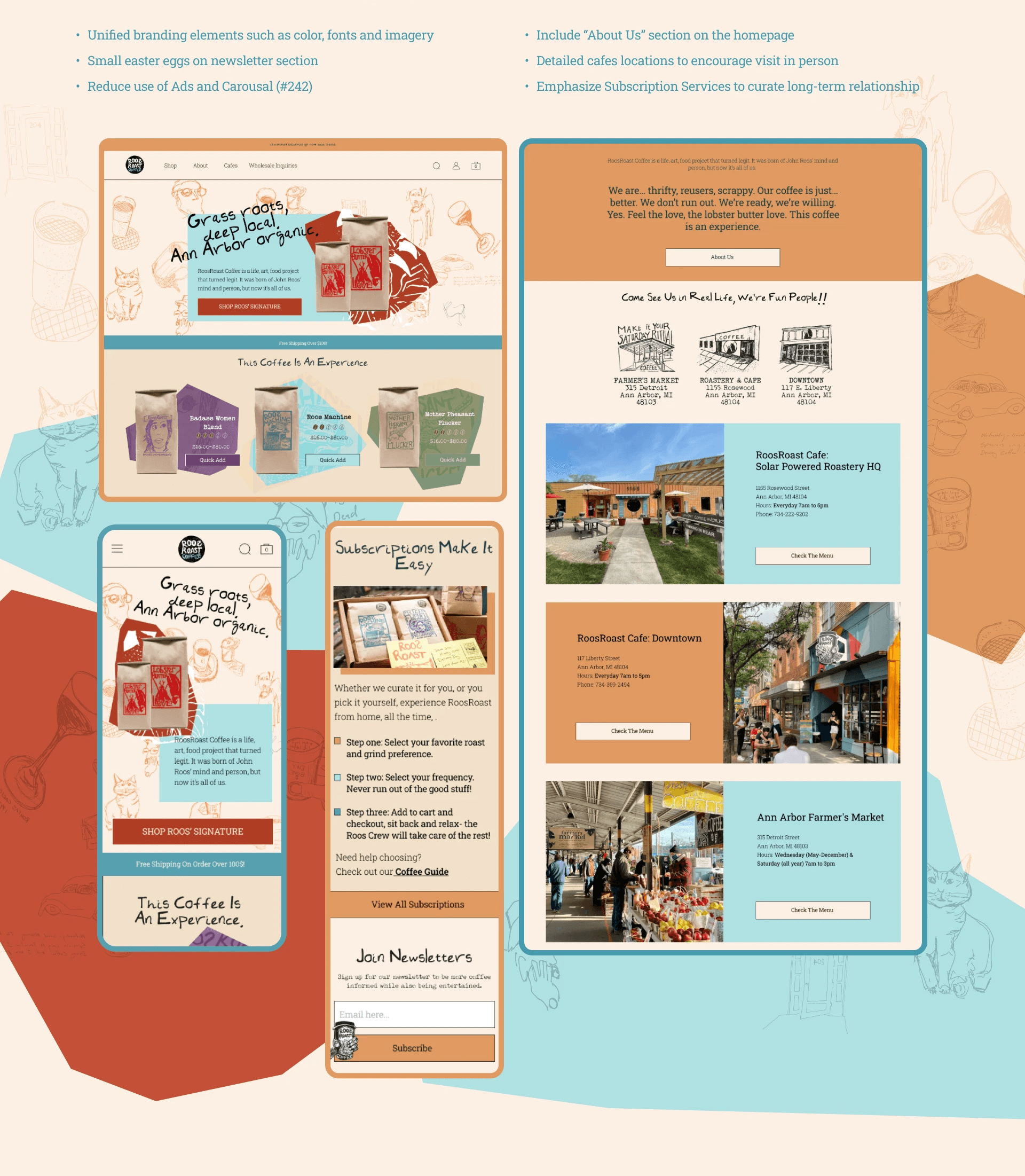
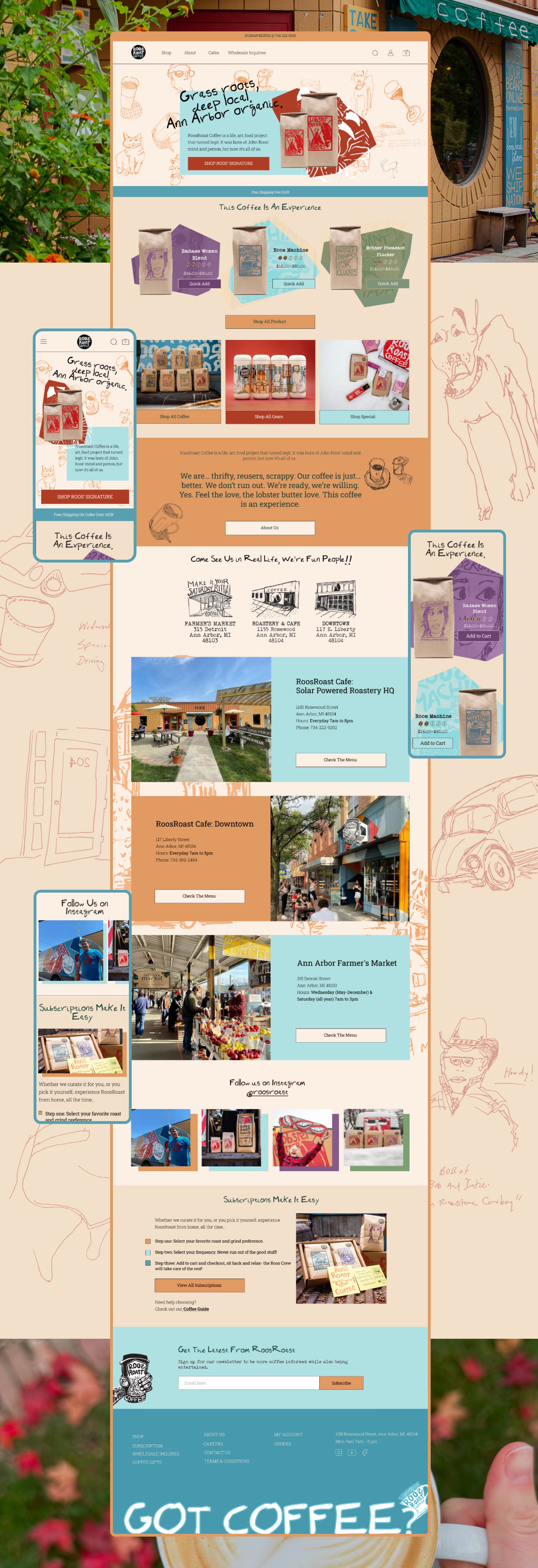
Upgraded Homepage: "Make Roos, Roos"
Enhanced Community Engagement and Cohesive Branding
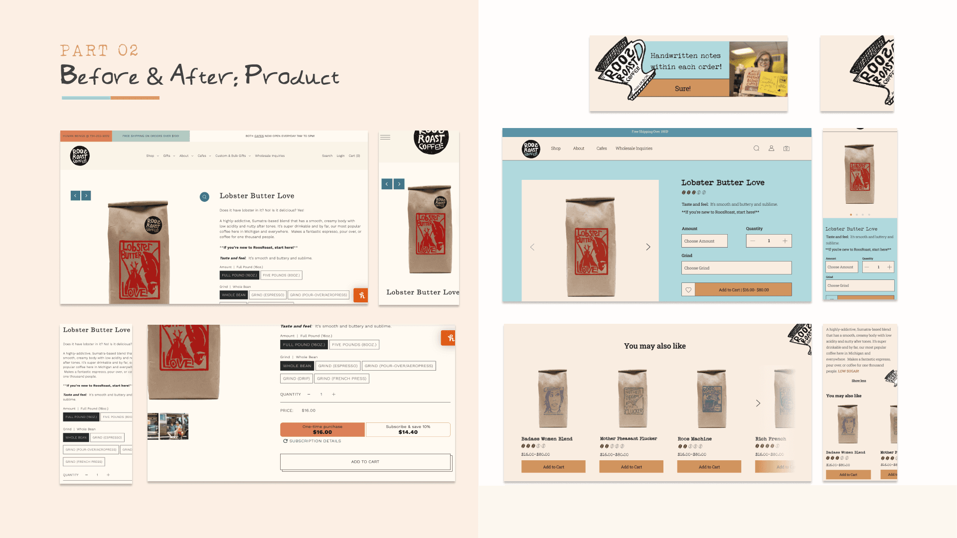
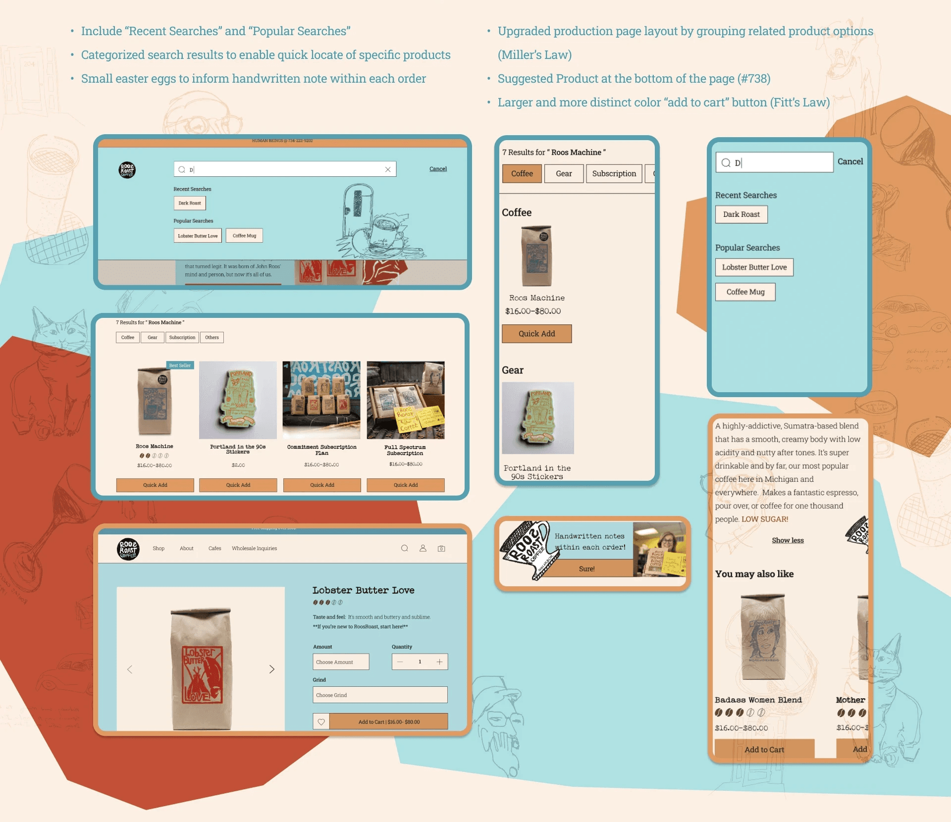
Product Page & Search: Direct Access to Production Information
Improved Accessibility of Production Information
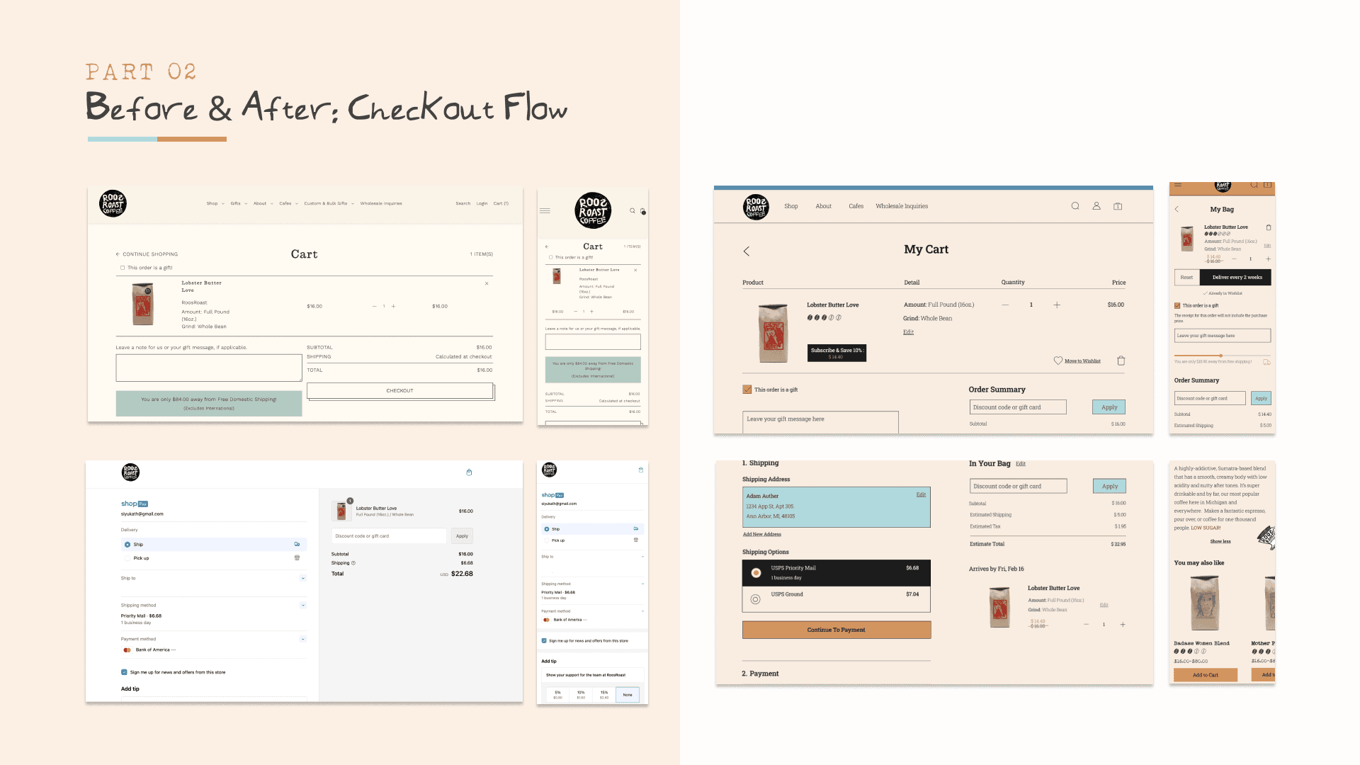
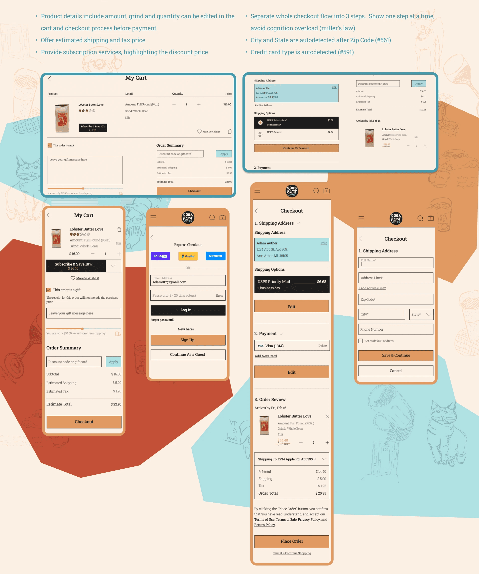
Shopping cart & Checkout flow: Frictionless checkout
Separate checkout steps and minimize page load
06
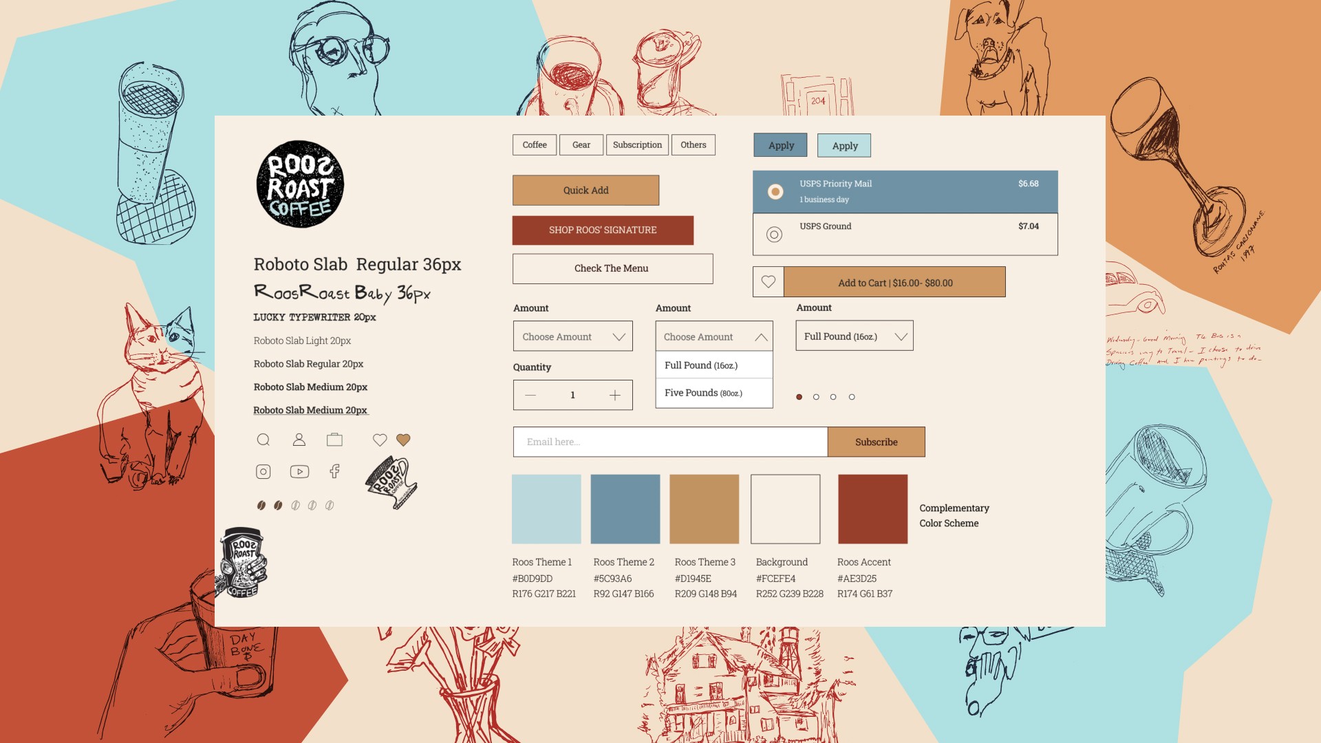
Style Guide
Vibrant colors to reflect Roos’ bold flavors
Playful and unique title fonts that communicate Roos’ eccentric vibe while keeping it legible
Roos' hand-drawn illustrations as easter eggs
Incorporation of Roos’ classic logos to connect with in person iconography
05
07.1
Upgraded Homepage
07.2
Revised Product Page
& Search Page
07.3
Upgrade Shopping
Cart & Checkout flow
08
Final Design
09
Beyond the Design
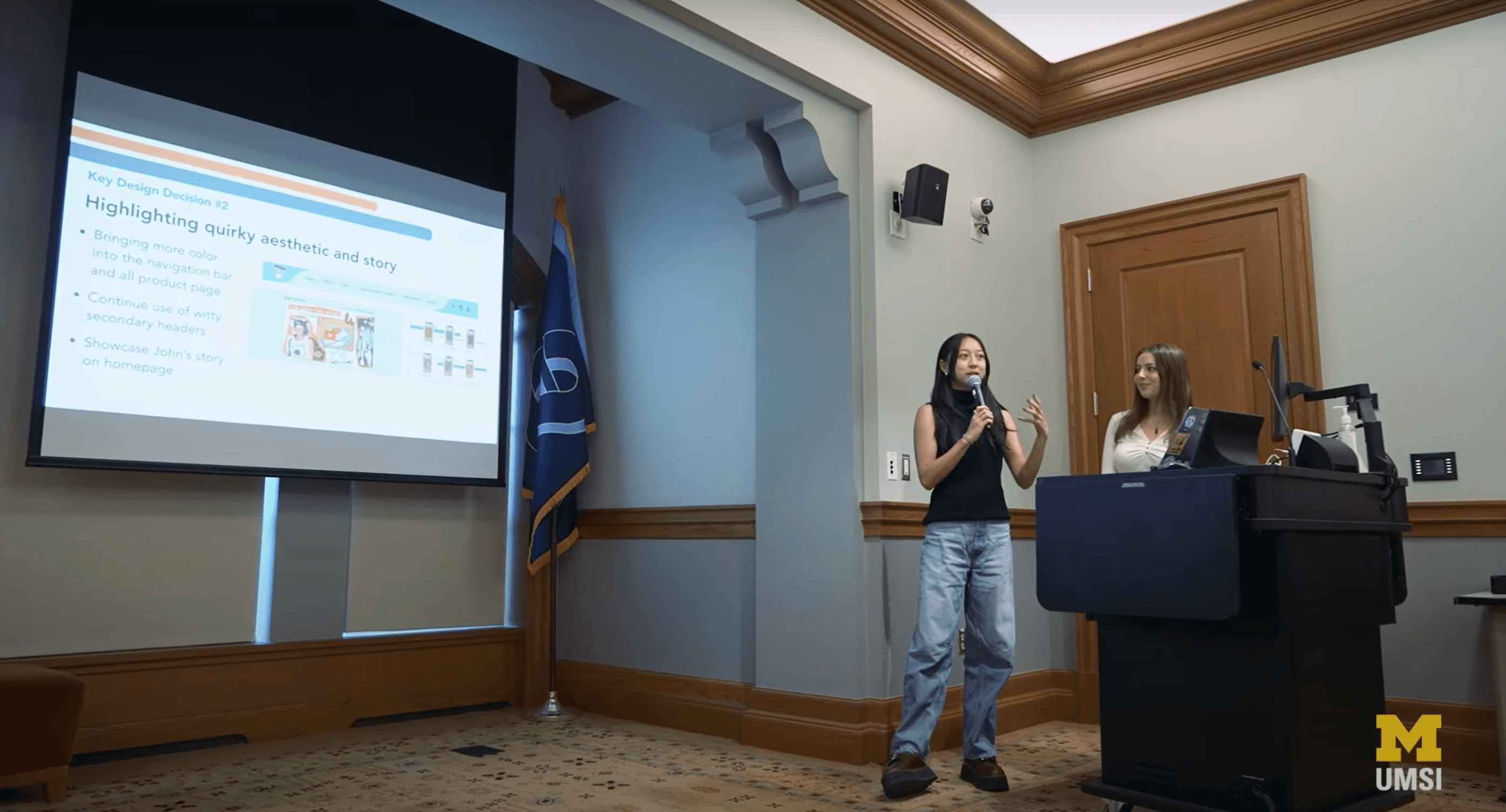
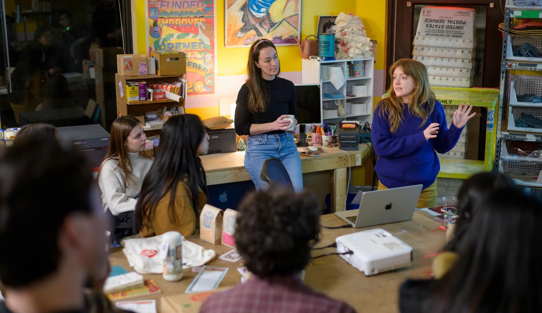
This project was brought to life at the University of Michigan - School of Information for the course “SI 311 - Laws of UX” taught by professor James Rampton. We eventually presented to John Roos, Founder of RoosRoast at the end of the project.
Below you can watch and read about the project and hear feedback from the RoosRoast' team!


